
TechNatSec
A visual identity for a conference at the intersection of technology and national security, built to feel authoritative, forward-looking, and distinctly its own.

A clear and modern website created to turn a complex technology product into a more understandable digital experience.
Ikigai Labs needed a website that could turn a complex technology product into a clear, trustworthy digital experience. The goal was to simplify the story, sharpen the structure, and create a visual system that felt modern without becoming cold.
I focused on clarity, hierarchy, and smooth Framer development to make the product easier to understand. The final website balances strong storytelling with a clean interface that supports both brand trust and product communication.
Challenge
Create one identity for a conference living between technology, national security, and two institutions with identities of their own.
The HBS and MIT Sloan Technology & National Security Conference brings together people across technology, defense, policy, investment and academia. The identity needed to feel credible in a serious national-security context while remaining contemporary enough for a conference focused on emerging technology and innovation.
Objective
Build a conference identity with institutional weight, without borrowing either institution’s brand.
The goal was to create a recognizable visual system that could connect the conference to its Harvard and MIT roots while establishing a character of its own, one that could work across digital communication, event environments and future editions.


THE IDEA
A symbol where MIT, Harvard, tech and national security meet.
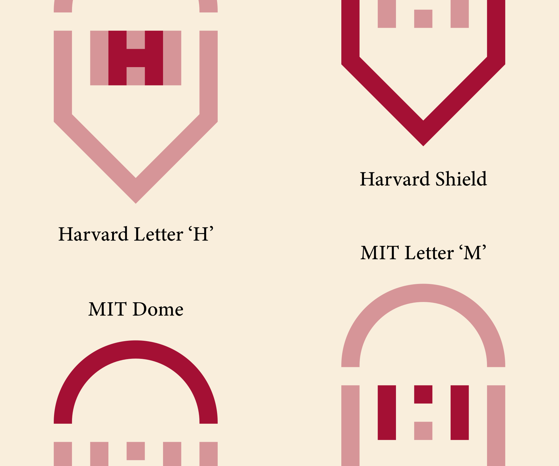
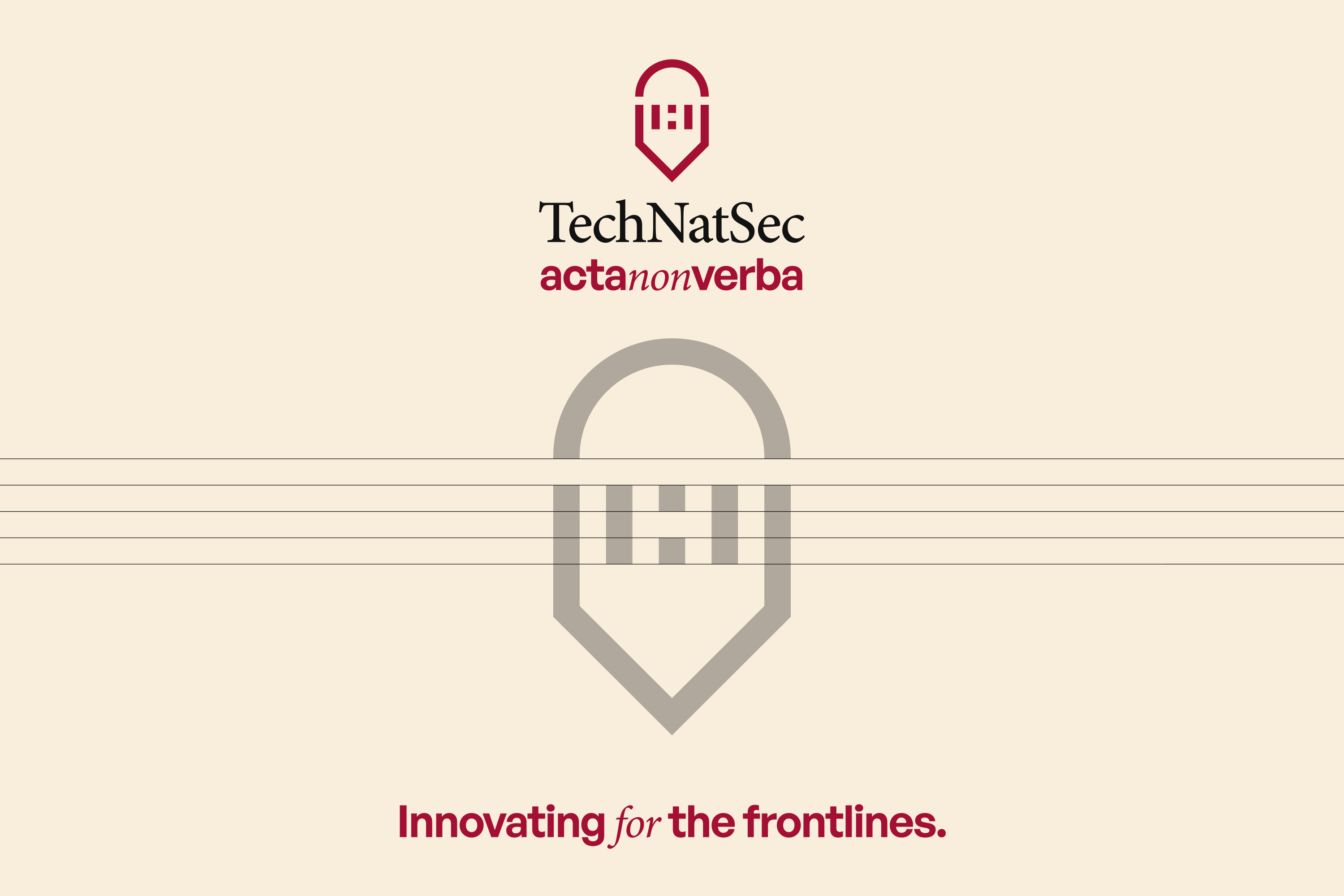
The mark brings three ideas into a single form. A semicircle references the architecture of MIT’s dome, while an “H” emerges through negative space as a subtle reference to Harvard. The outer silhouette takes on the character of a shield, connecting the symbol to protection and national security. The whole aesthetic of the logomark is sharp suggesting a tech-forward visual.
Rather than placing references to the two institutions side by side, the idea was to compress them into a mark that could belong to the conference itself.

Brand Direction
Academic authority, sharpened for a defense-tech audience.
Two visual directions were explored early in the process: one leaning into institutional authority and the other toward a more contemporary technology language. The final identity brought elements of both together, balancing seriousness with a more progressive, innovation-led character.


Logo System
A compact mark designed to hold its own at every scale.
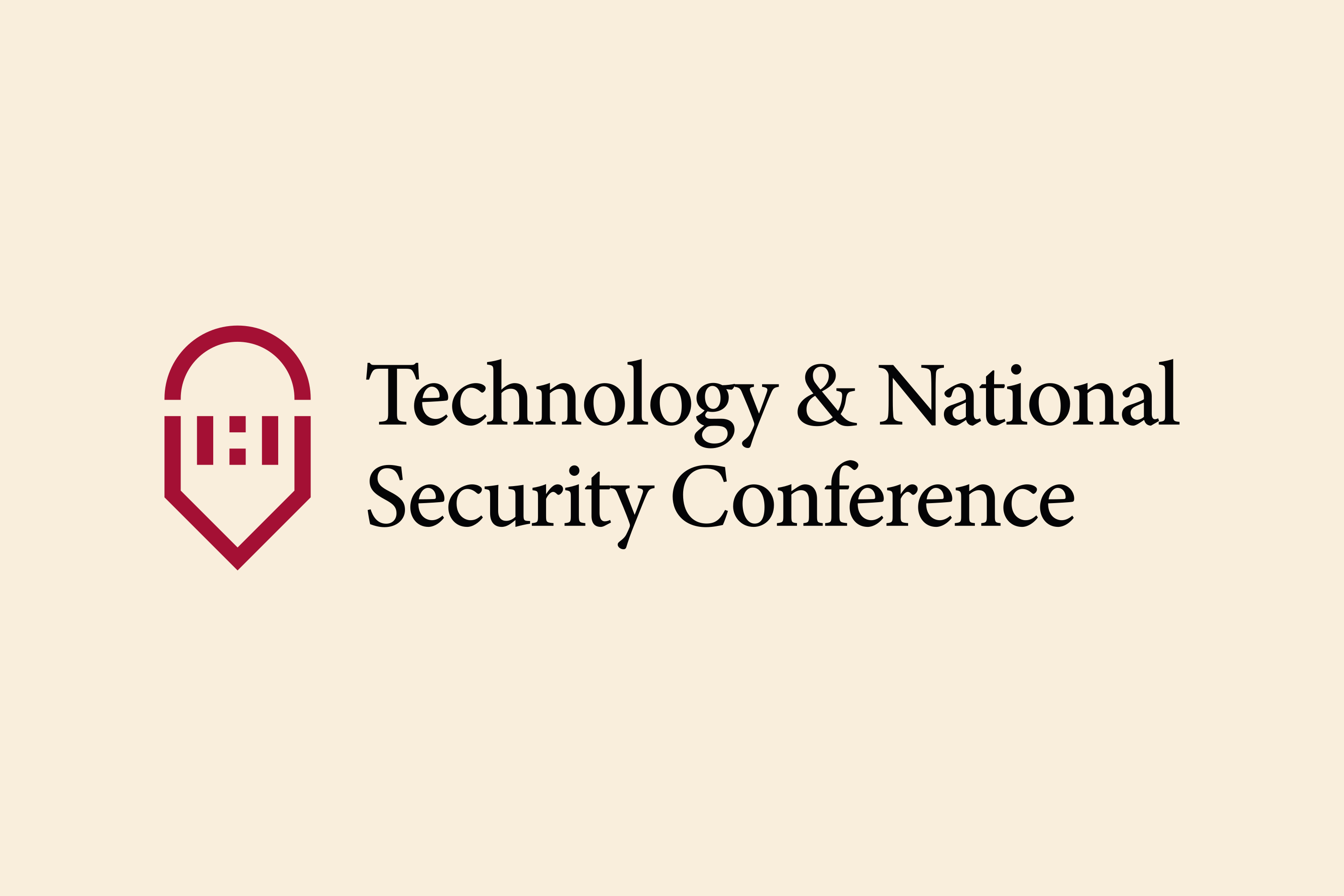
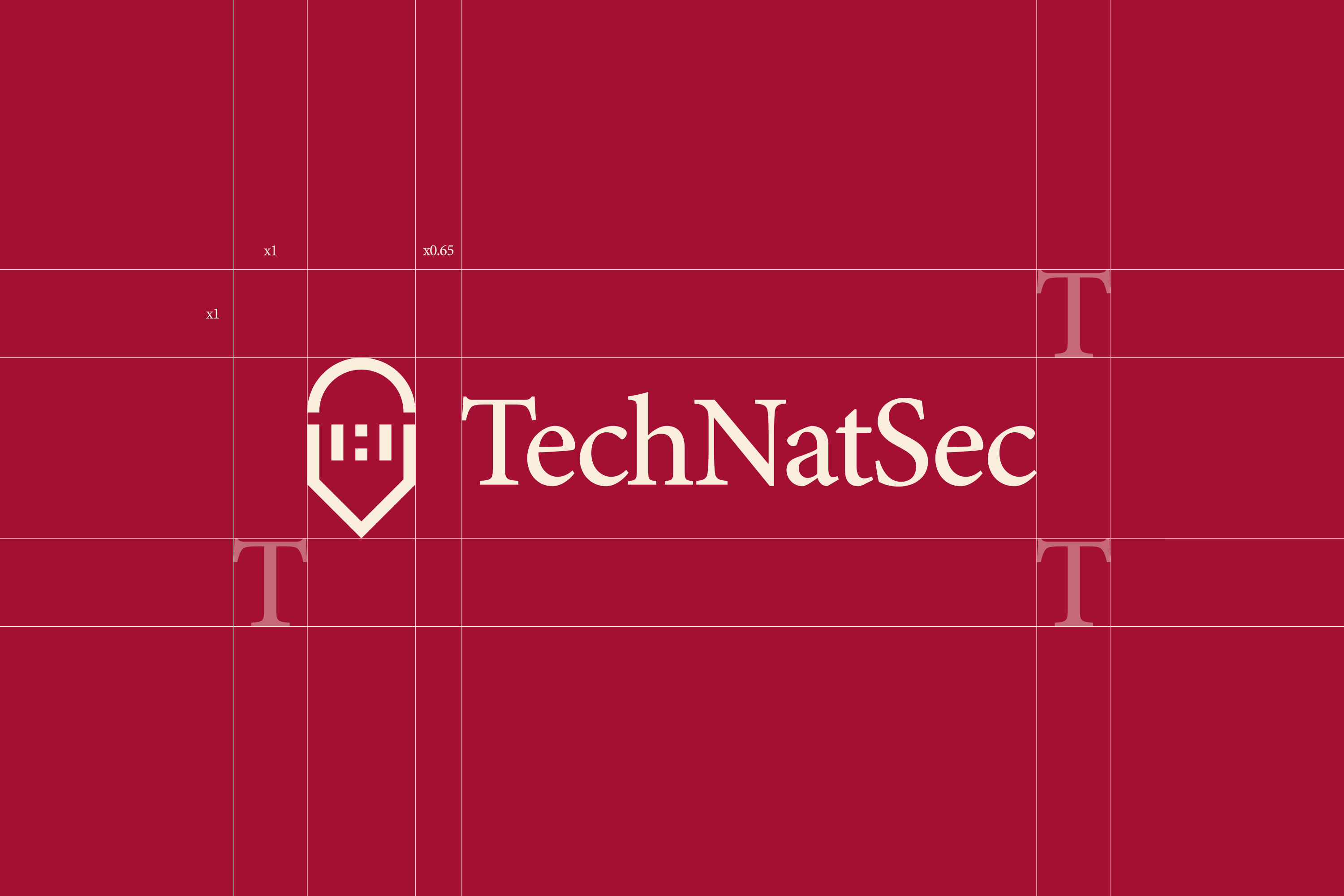
The symbol was developed as the most recognizable part of the system, working independently or alongside the TechNatSec wordmark across both small digital formats and larger conference applications.
The wordmark was refined to bring more authority and permanence to the identity. A serif treatment creates a stronger connection to the academic context surrounding the conference, while contrasting with the more geometric character of the symbol. Together, the two elements balance institutional credibility with a contemporary technology-focused presence.
COLOR
A shared red language, grounded by black and warm white.
Ruby Red creates a visual connection to both Harvard’s crimson and MIT’s red without reproducing either institution’s palette directly. A deep near-black brings weight and contrast, while a warm off-white softens the system and gives it a more editorial, academic character.


Font Hierarchy
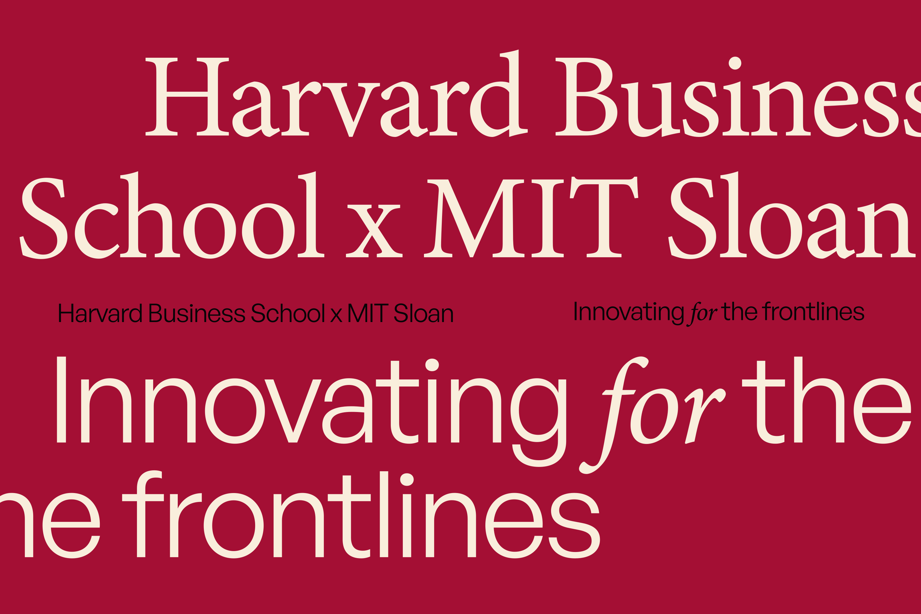
A typographic system built around contrast, clarity, and hierarchy.
The identity combines a more expressive serif voice with a clean supporting typeface for functional communication. The serif brings character and editorial weight to major moments, while the secondary typeface keeps schedules, speaker information, digital content, and smaller details direct and highly legible.


In Application
A system designed to hold its presence at conference scale.
The identity combines a more expressive serif voice with a clean supporting typeface for functional communication. The serif brings character and editorial weight to major moments, while the secondary typeface keeps schedules, speaker information, digital content, and smaller details direct and highly legible.


TESTIMONIAL

Liz Lippie Rimmer
Organizer of the 2024 edition
Next
Project.
Continue through the selected work.
