
McGinty
A visual identity for a consulting firm helping organizations turn complex projects into lasting growth.

Building credibility without losing the human side of consulting.
McGinty Consulting works with organizations of very different scales, from nonprofits and growing businesses to large institutions, across project management, business development, education, and international development. The identity needed to feel established enough for high-stakes institutional work while remaining approachable and flexible for the smaller teams McGinty supports.
The result is a visual system built around growth, clarity, and a sense of steady progress.
Challenge
One identity for a practice solving very different kinds of problems.
McGinty’s work stretches across proposals, project delivery, monitoring and evaluation, business growth, training, and education. The challenge was to create a brand that could represent that breadth without feeling vague or fragmented. It needed to communicate expertise and reliability while avoiding the cold, interchangeable language often associated with traditional consulting firms.
Objective
Create a professional identity that feels established, but never distant.
The goal was to give McGinty a recognizable presence that could build confidence with institutional clients while still feeling accessible to organizations looking for a collaborative partner. The system needed to work across formal proposals and presentations as comfortably as it did across everyday communication and digital content.


THE IDEA
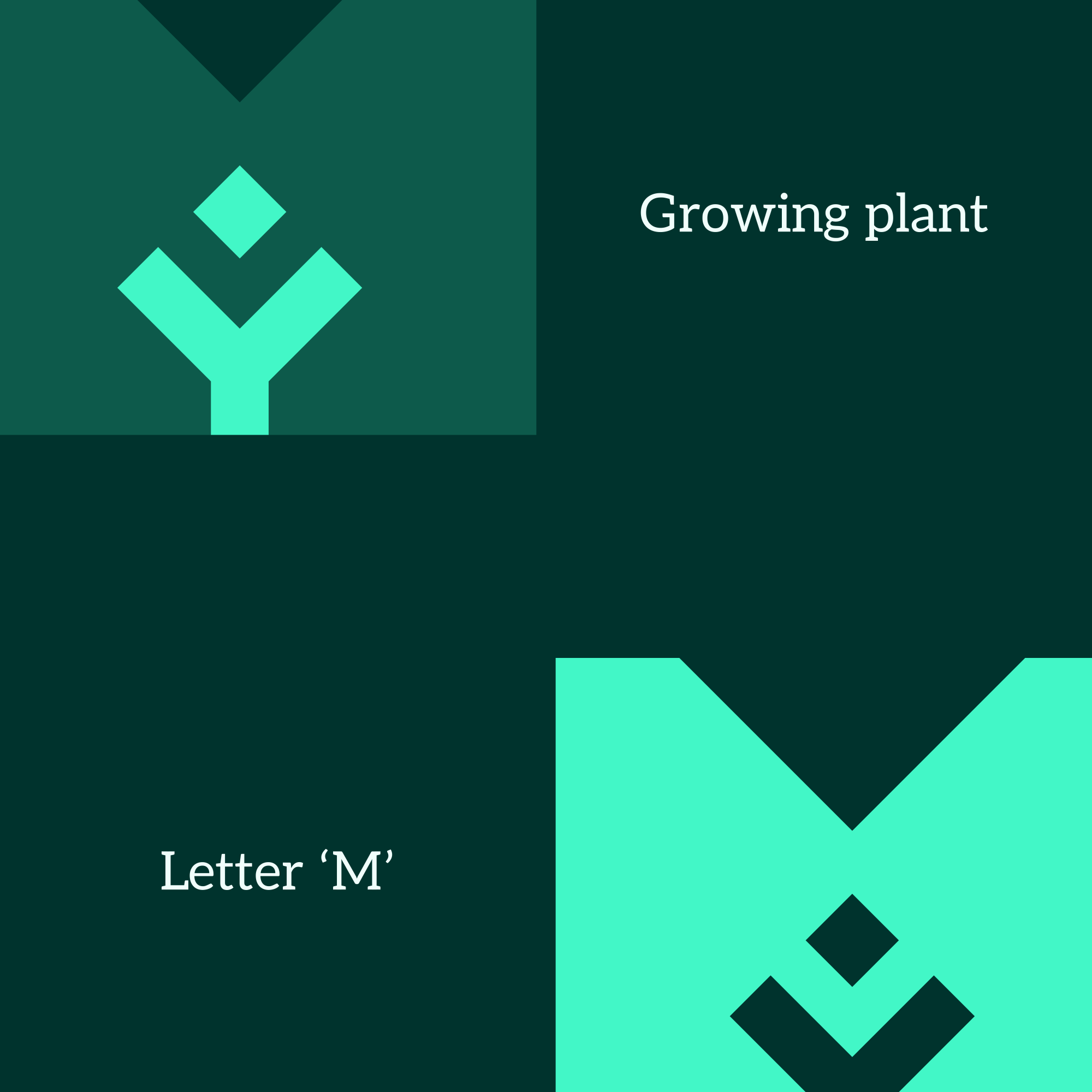
Growth, built into the M.
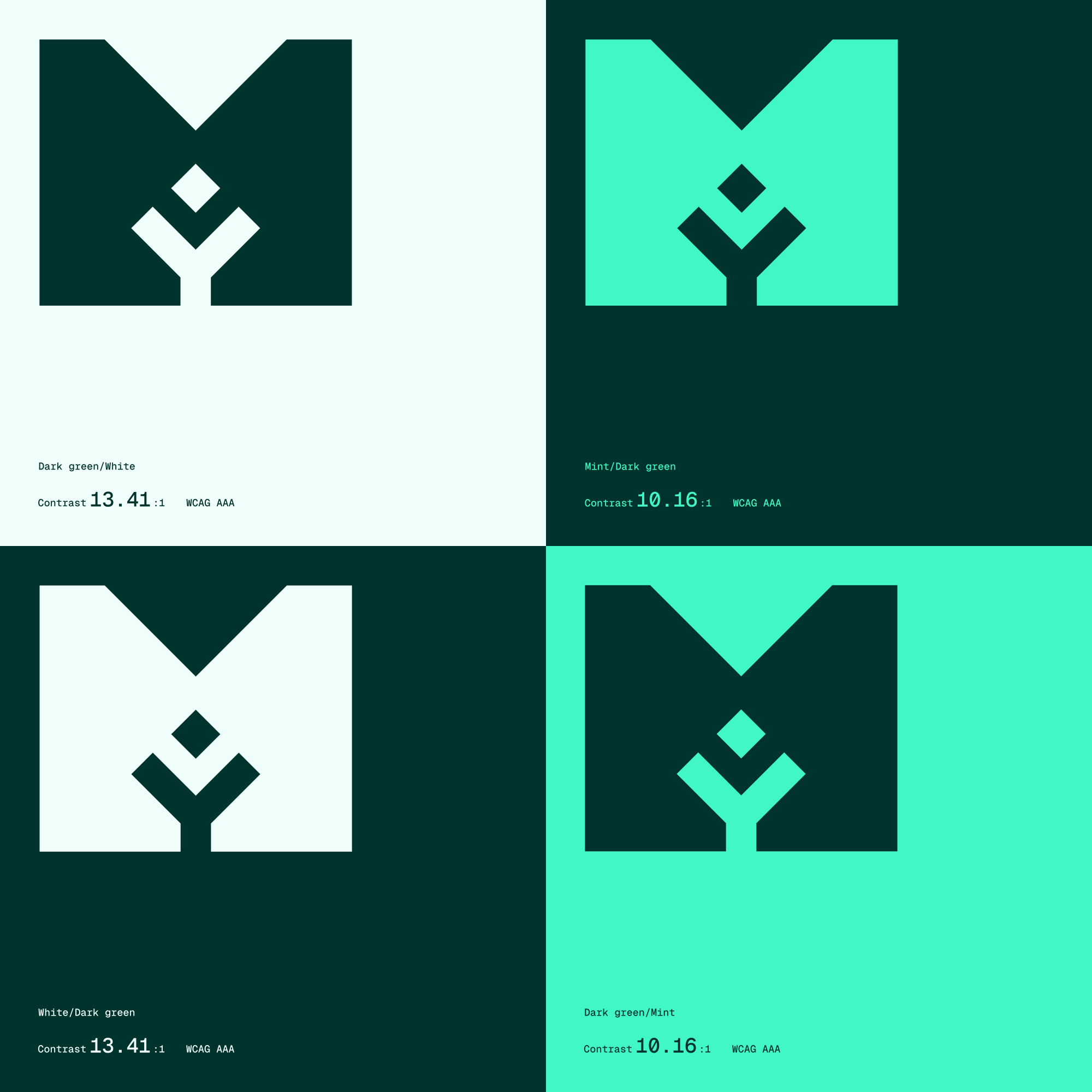
The identity begins with the initial of the McGinty name. Within the structure of the M, negative space forms an organic shape that can be read as a seedling or tree, turning the letter into a symbol of growth and development. Rather than adding a separate growth icon to the identity, the idea is embedded directly into the mark itself.

Brand Direction
Institutional credibility with a more considered, human character.
The visual direction was developed to balance two sides of McGinty: the professionalism needed to work with large organizations and the collaborative character of a firm that supports teams directly. A restrained palette, editorial typography, generous layouts, and organic details keep the identity composed and credible without making it feel overly corporate.


Logo System
An initial transformed into a symbol of progress.
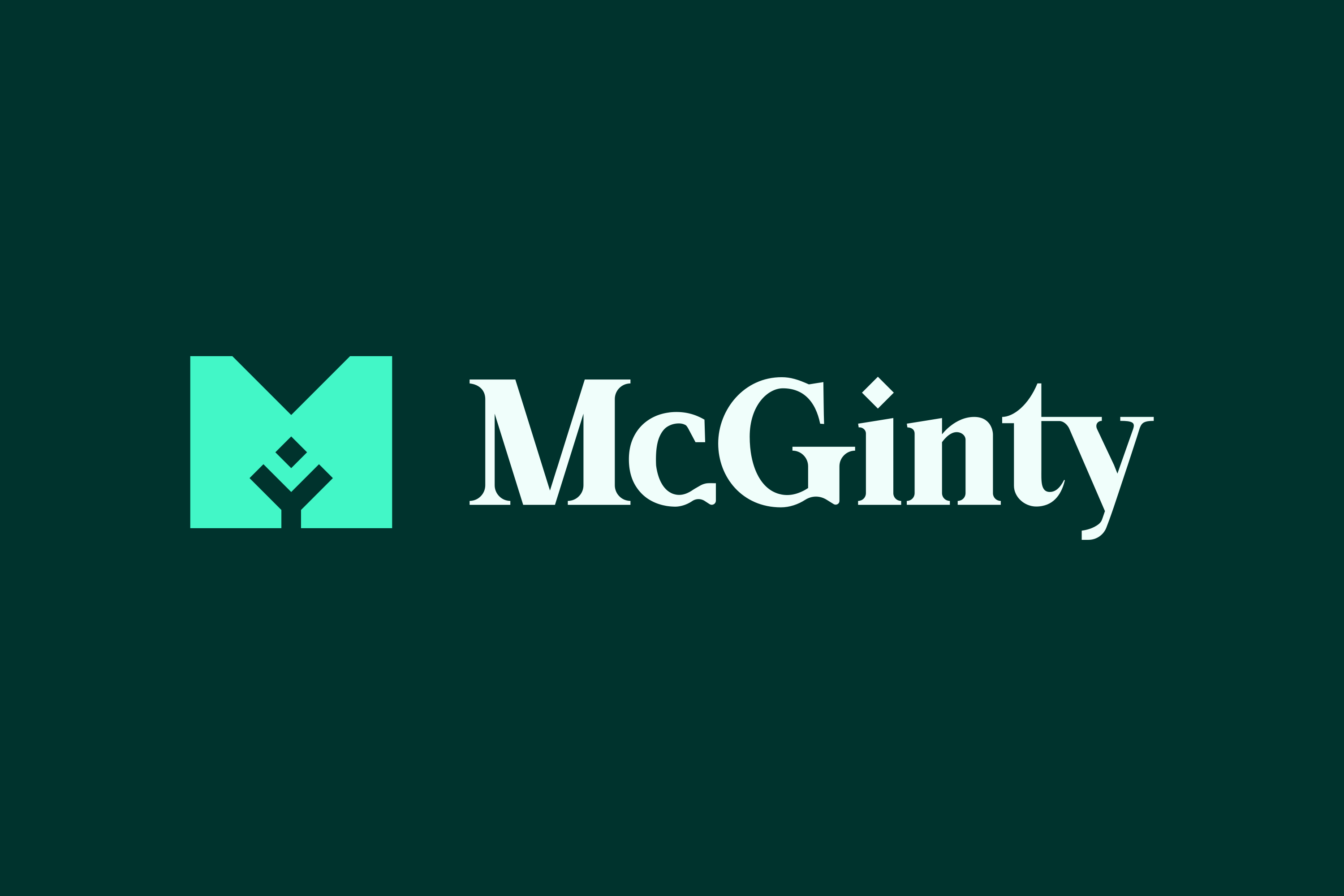
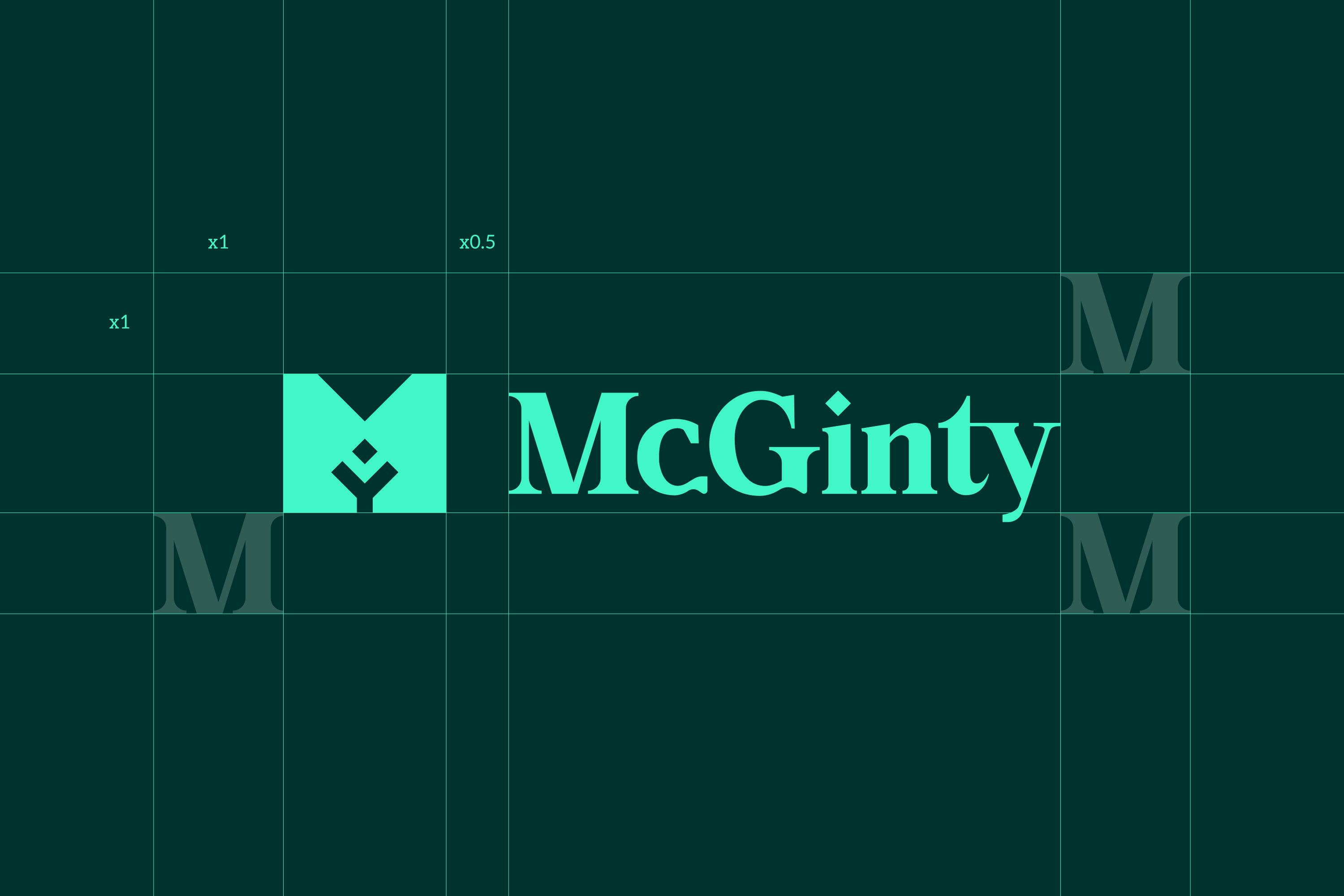
The McGinty mark was designed to work both as a recognizable standalone symbol and as part of the full wordmark. Its simple silhouette keeps it practical across different scales, while the negative-space detail gives the identity a more distinctive idea that can carry beyond the logo itself.
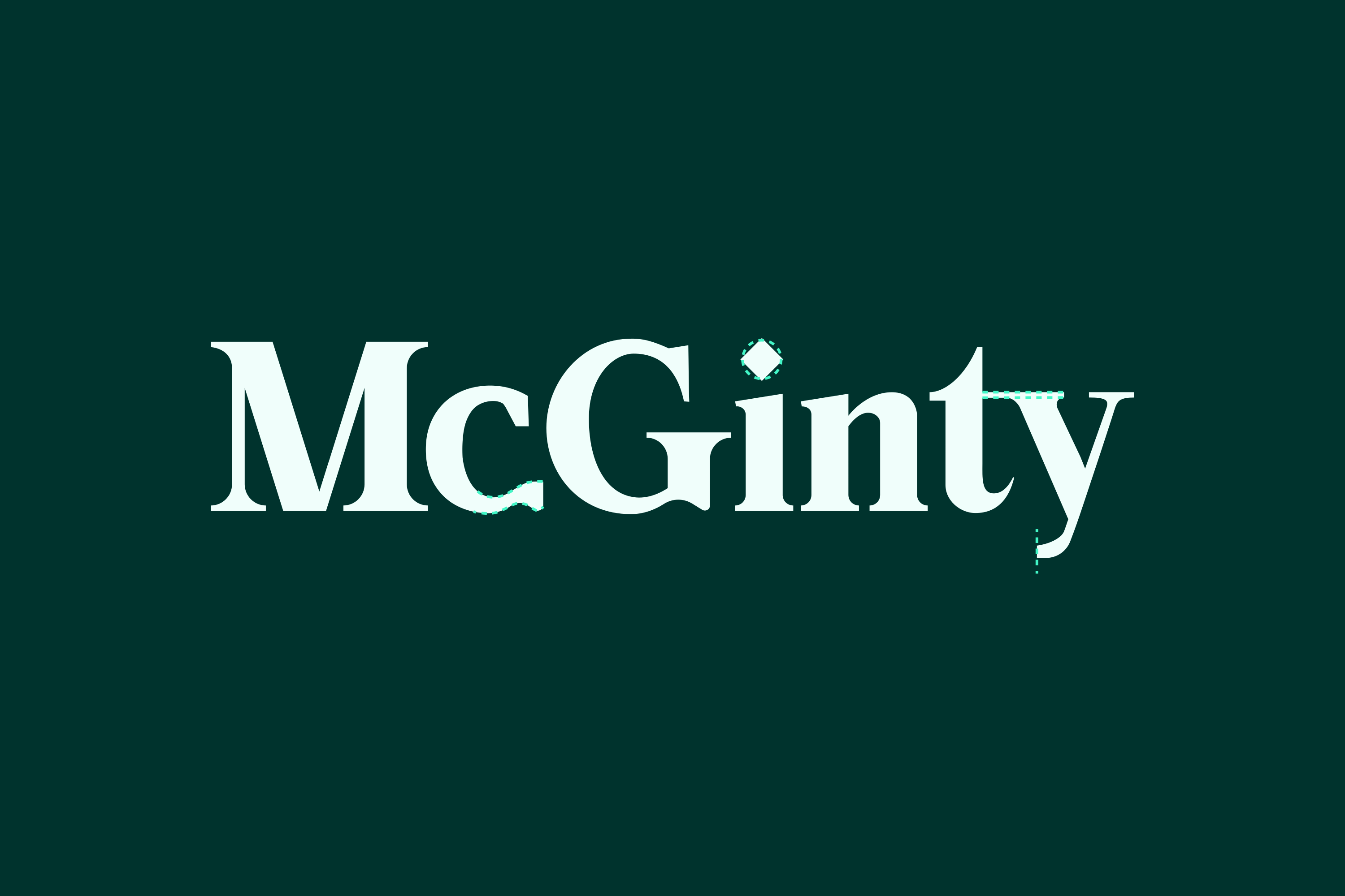
The serif-led typography gives McGinty a more established and considered character, complementing the simplicity of the symbol and creating a clear point of difference from the heavily sans-serif language common across modern consulting brands. The system combines that stronger personality in key brand moments with clear, functional typography for information-heavy communication.
COLOR
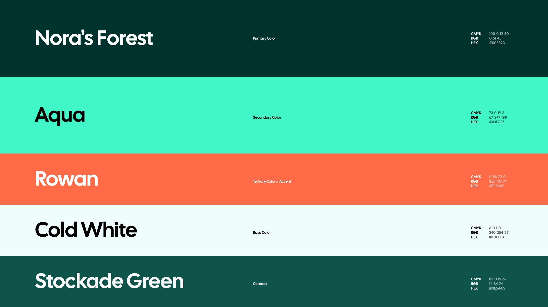
A restrained palette built around one recognizable green.
Deep green anchors the identity and gives McGinty a consistent presence across both formal and more expressive applications. A lighter mint tone creates contrast and gives the system room to breathe, allowing the same palette to move between dense business communication and more open brand moments without requiring a large number of colors.
Font Hierarchy
An editorial voice supported by everyday clarity.
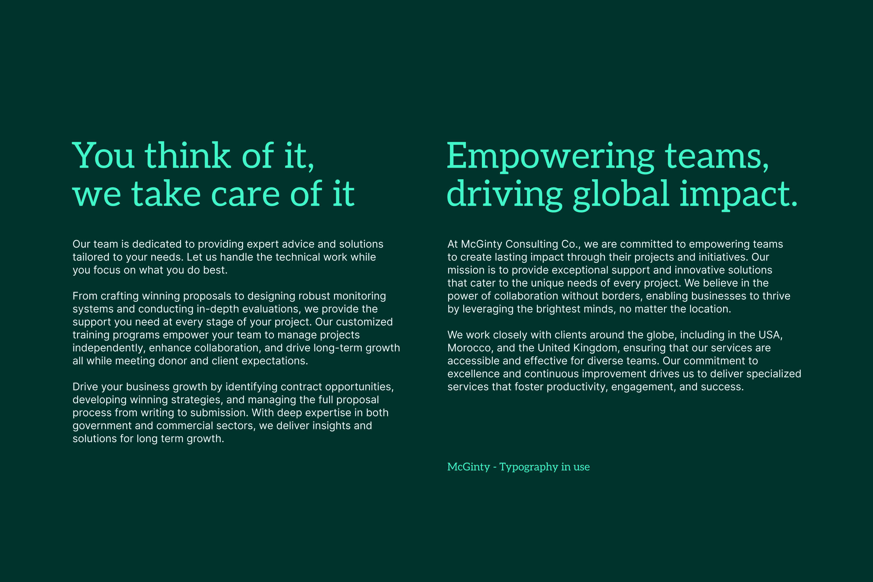
Aleo leads the McGinty identity across headlines and key brand moments, giving the system a more established, thoughtful character that suits the consultancy’s professional and human approach. Inter supports it across body copy, navigation, presentations, and information-heavy content, where clarity and flexibility matter most. Together, the pairing creates a clear hierarchy: Aleo brings personality and authority, while Inter keeps communication direct, accessible, and easy to navigate.


In Application
Designed for the materials where consulting actually happens.
Aleo leads the McGinty identity across headlines and key brand moments, giving the system a more established, thoughtful character that suits the consultancy’s professional and human approach. Inter supports it across body copy, navigation, presentations, and information-heavy content, where clarity and flexibility matter most. Together, the pairing creates a clear hierarchy: Aleo brings personality and authority, while Inter keeps communication direct, accessible, and easy to navigate.



TESTIMONIAL

Jennifer McGinty
Founder & CEO at McGinty Consulting