
Sojourn
A contemporary identity rooted in the character of Morocco.
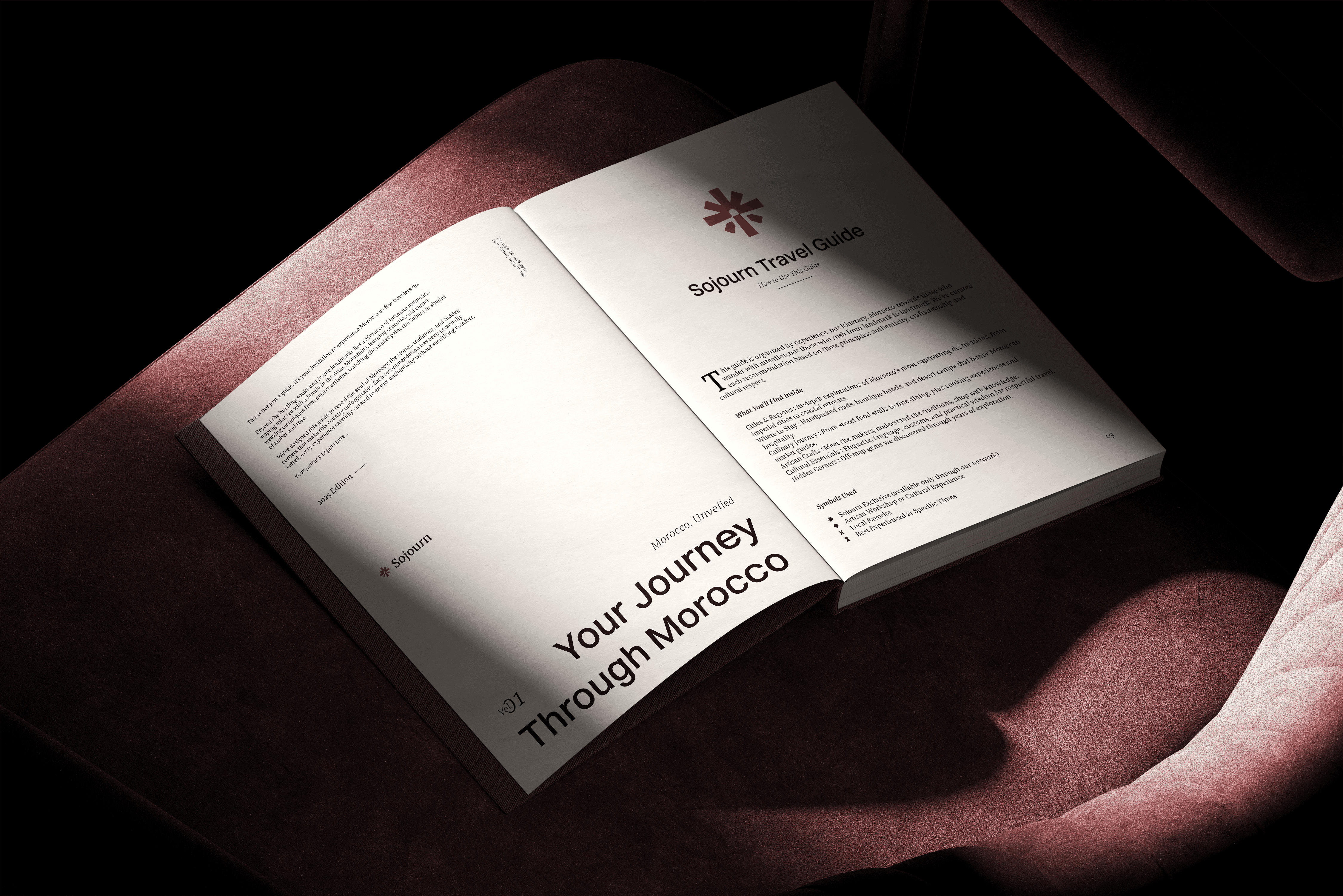
Bringing a modern consultancy and a distinctly Moroccan character into one identity.
Sojourn Consulting operates across tourism, cultural experiences, study abroad, and international business relations, connecting people and organizations with opportunities in Morocco. The identity needed to reflect that breadth while still feeling like one coherent brand. The result was a contemporary visual system shaped by references to Moroccan culture, combining a professional international presence with a strong sense of place.
Challenge
Balancing modern professionalism with the richness of traditional Morocco.
Sojourn needed to feel credible to international businesses and institutions without becoming another generic consulting brand. At the same time, its connection to Morocco had to be immediately present without relying on obvious or overly decorative cultural clichés. The challenge was made more complex by the breadth of the business itself: tourism, cultural immersion, education, market entry, and international partnerships all needed to feel at home within the same identity.
Objective
Create one contemporary system capable of carrying many stories.
The objective was to build an identity that could move comfortably between cultural and corporate contexts: modern enough to represent a professional consultancy, distinctive enough to feel recognizably Moroccan, and flexible enough to support Sojourn’s different areas of activity. Traditional references would be expressed through considered forms and a color palette rooted in Morocco, rather than through literal ornament, allowing the brand to feel culturally connected without losing clarity or professionalism.


THE IDEA
Three ways of experiencing Morocco, brought into one mark.
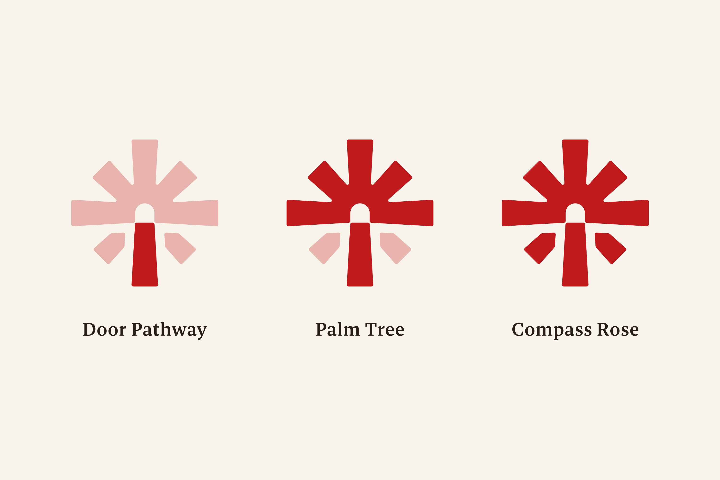
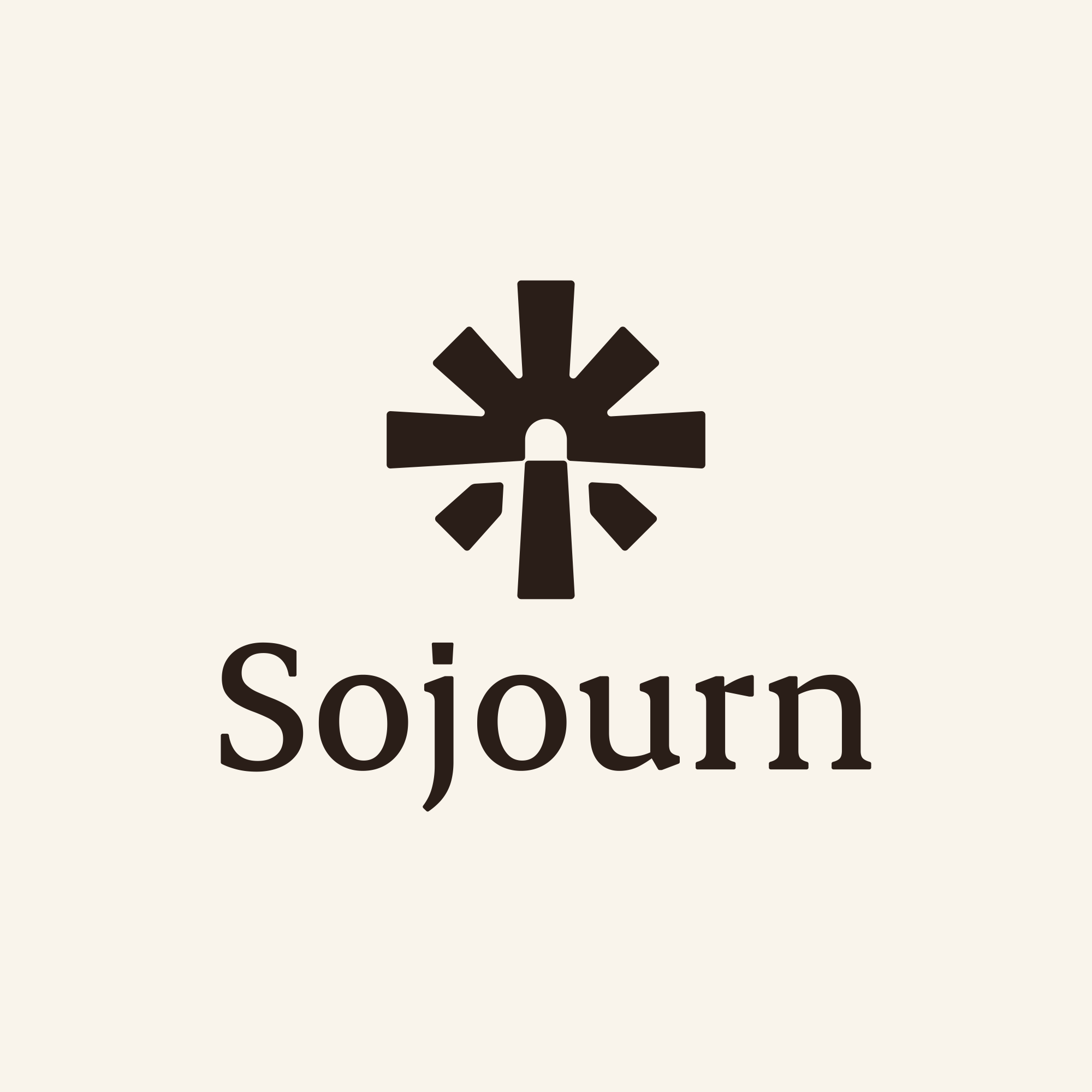
The symbol combines three ideas at the heart of Sojourn. A doorway represents access and the beginning of a journey; the palm tree connects the identity to Morocco and its landscape; and the compass rose introduces the idea of direction, discovery, and guidance. It reflects Sojourn’s role in helping people and organizations find their way into Morocco.

Brand Direction
Contemporary in expression, distinctly Moroccan in character.
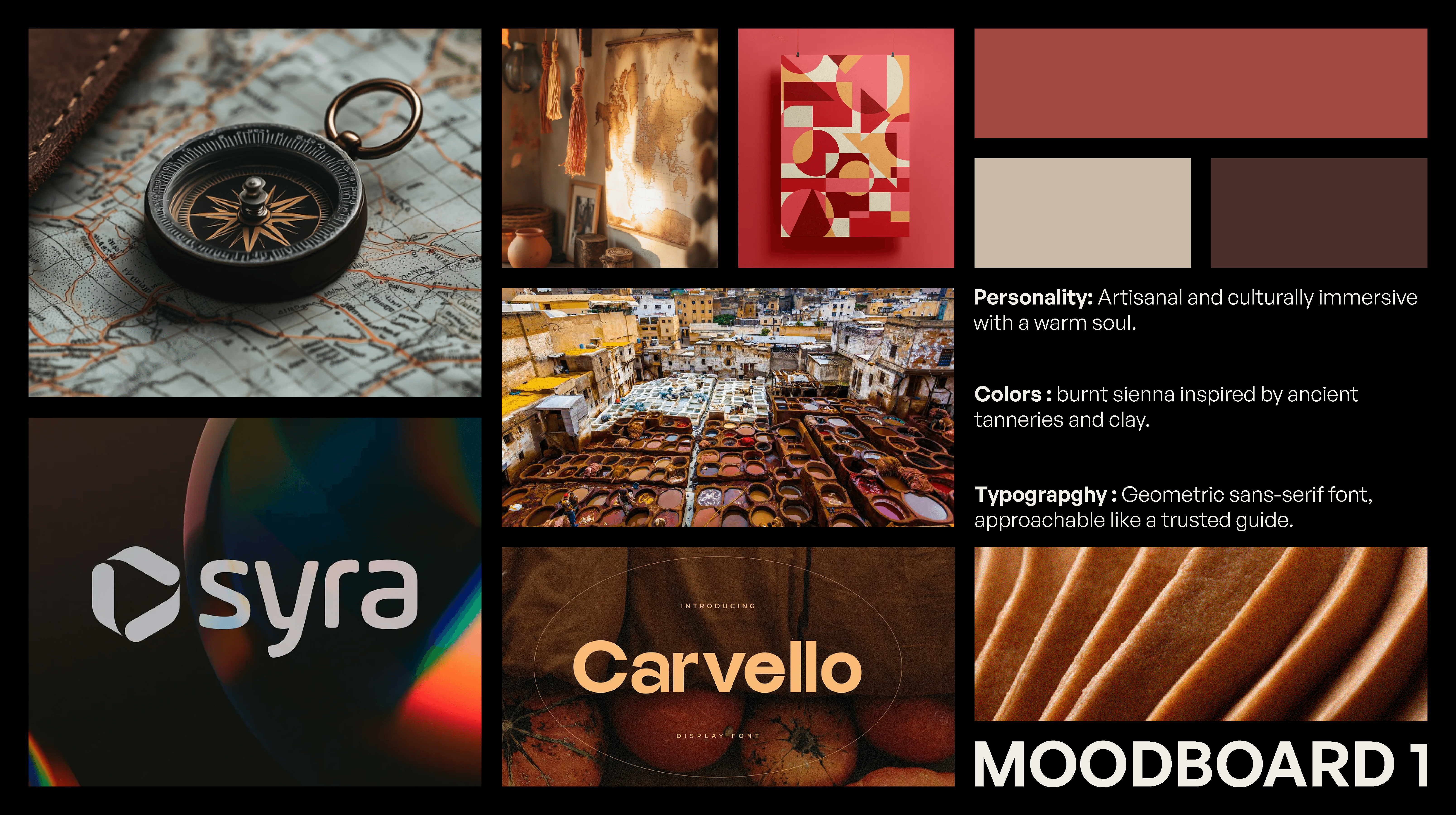
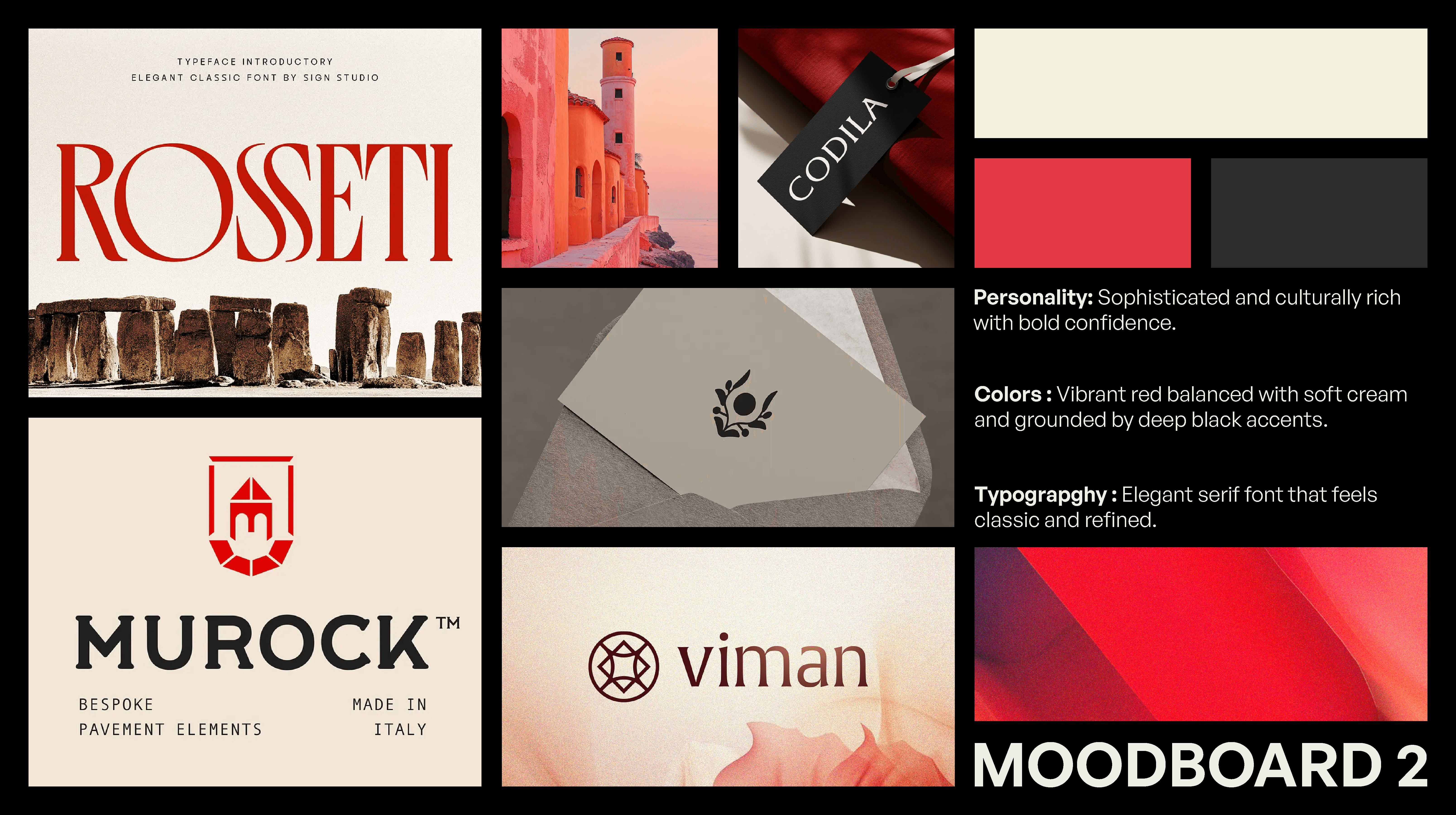
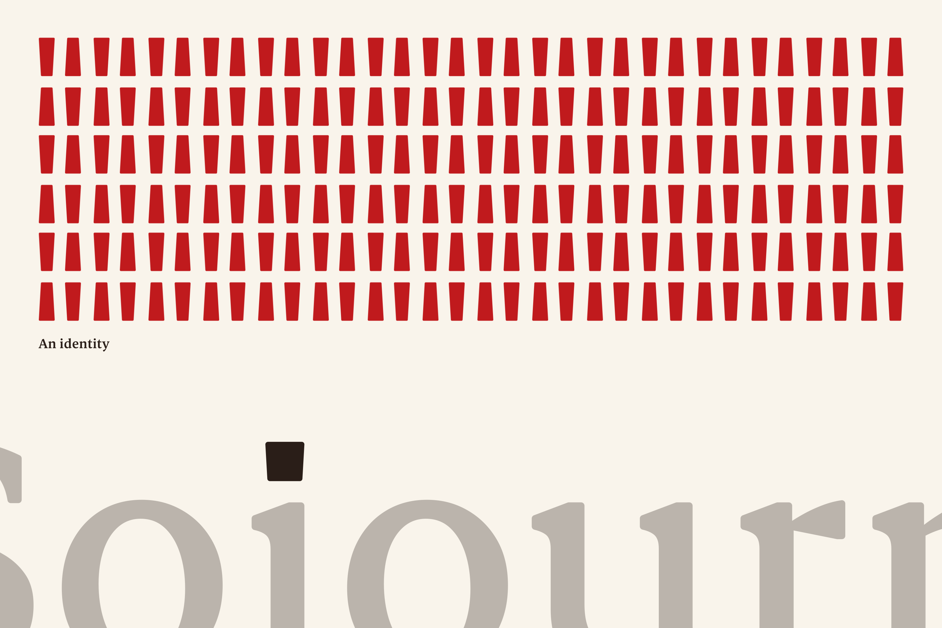
The visual direction needed to sit comfortably between two worlds. Sojourn works in professional and international contexts, but its value is deeply connected to local knowledge, culture, and place. The system therefore avoids both generic corporate aesthetics and overly literal Moroccan ornament. Clean layouts, bold geometry, and contemporary typography establish professionalism, while color, form, and selected cultural references give the identity its connection to Morocco.
Logo System
A layered symbol designed to remain simple at first glance.
Although the mark brings together several references, it was designed to read first as a single, recognizable form. Its compact geometry allows it to work independently at small sizes while supporting fuller lockups when more context is needed. This gives Sojourn a consistent visual anchor across different parts of the business without tying the identity to only tourism, consulting, education, or any one service.

COLOR
A contemporary palette drawn from the colors of Morocco.
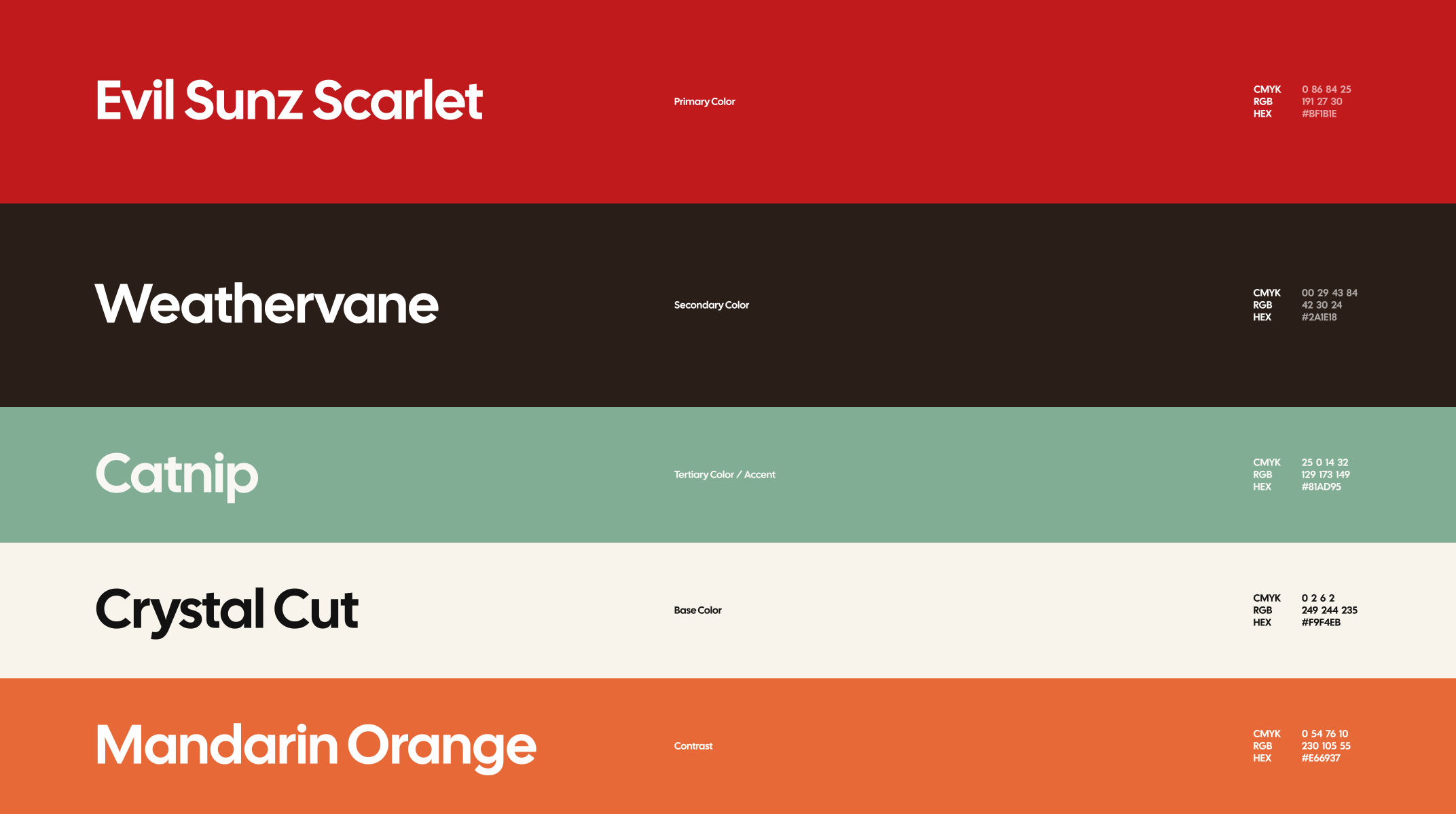
The palette builds around a strong scarlet red, connecting the identity immediately to Morocco while giving the brand a confident and recognizable presence. Deep brown introduces an earthy foundation, while warm cream softens the system and references the sun-washed surfaces found throughout Moroccan architecture. Muted green and orange extend the palette with references to vegetation, tilework, earth, and terracotta, creating a system that feels culturally grounded without becoming ornamental.
Font Hierarchy
Modern clarity balanced with a more expressive editorial voice.
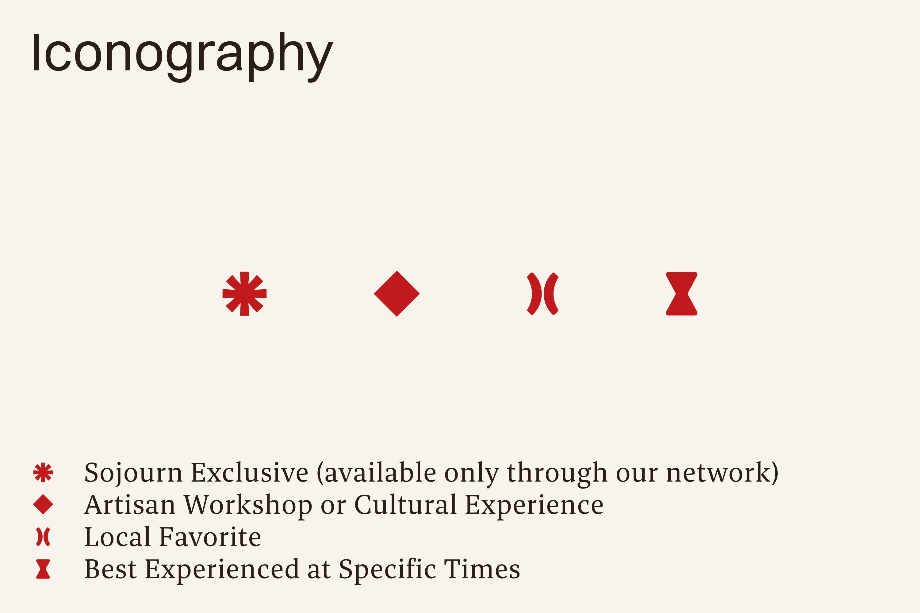
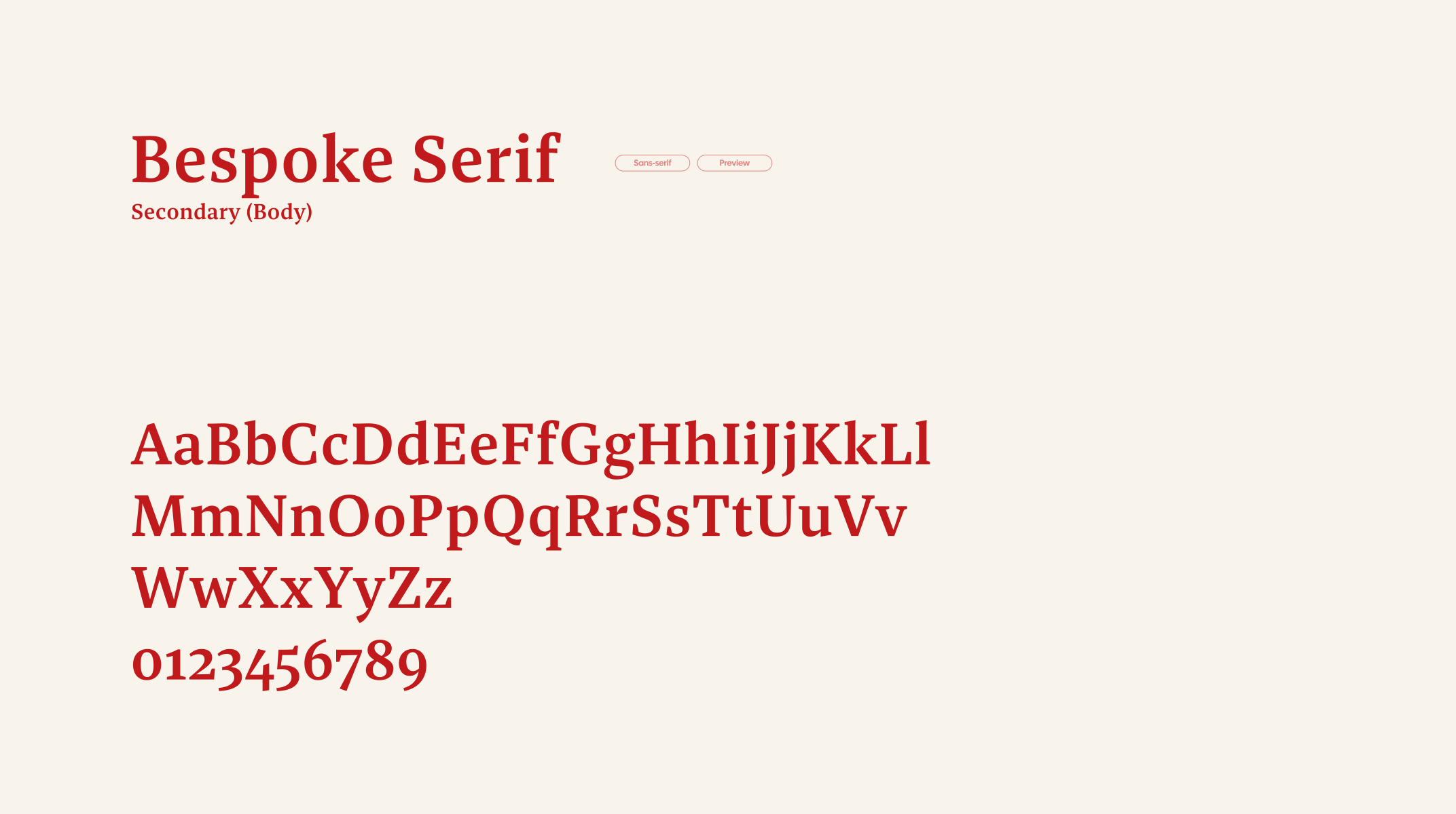
Switzer leads the identity with a clean, contemporary sans serif suited to headlines and key communications. Its straightforward forms give Sojourn the clarity and professionalism required across business-facing applications. Bespoke Serif introduces a contrasting secondary voice with more warmth and character, bringing an editorial quality to longer-form communication and creating a subtle connection between the identity’s modern structure and its more culturally rooted side.

In Application
Built to move between business and experience.
Switzer leads the identity with a clean, contemporary sans serif suited to headlines and key communications. Its straightforward forms give Sojourn the clarity and professionalism required across business-facing applications. Bespoke Serif introduces a contrasting secondary voice with more warmth and character, bringing an editorial quality to longer-form communication and creating a subtle connection between the identity’s modern structure and its more culturally rooted side.


TESTIMONIAL
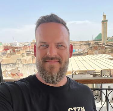
Adrian Bonnett
Founder of Sojourn