
Integralty
A cybersecurity identity built around integrity, integration, and protection designed to grow into a broader brand ecosystem.

Building a brand system capable of growing with the business.
What began as a visual identity for Integralty developed into a broader brand system spanning digital communication, illustration, web design, and eventually a distinct identity for Integralty Growth Partners. The project needed to bring a wide range of cybersecurity capabilities under one recognizable language while remaining flexible enough to support new services, audiences, and extensions of the business.
Challenge
Bringing a broad cybersecurity offer under one clear identity.
Integralty works across strategic cybersecurity leadership, risk and compliance, security architecture, managed services, and IT operations. The challenge was to create an identity capable of representing that breadth without making the company feel fragmented or like another generic cybersecurity provider. It needed to communicate technical credibility while still reflecting the clarity and relationship-driven approach behind the business.
Objective
Build a brand that feels secure, capable, and easy to trust.
The goal was to create a recognizable visual system that could bring Integralty’s different capabilities together under a single point of view. It needed enough authority for conversations around risk and security, enough clarity for complex technical information, and enough flexibility to move across presentations, digital experiences, client communication, and future extensions of the business.


THE IDEA
Integration transformed into protection.
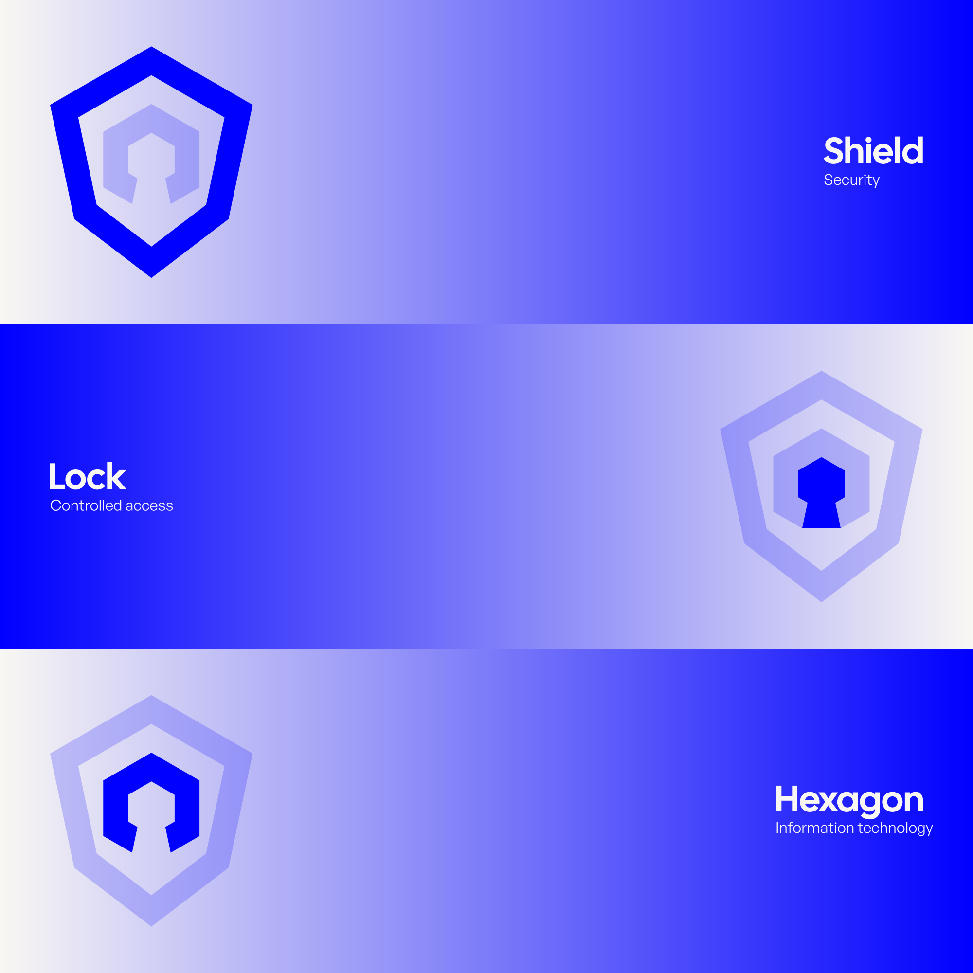
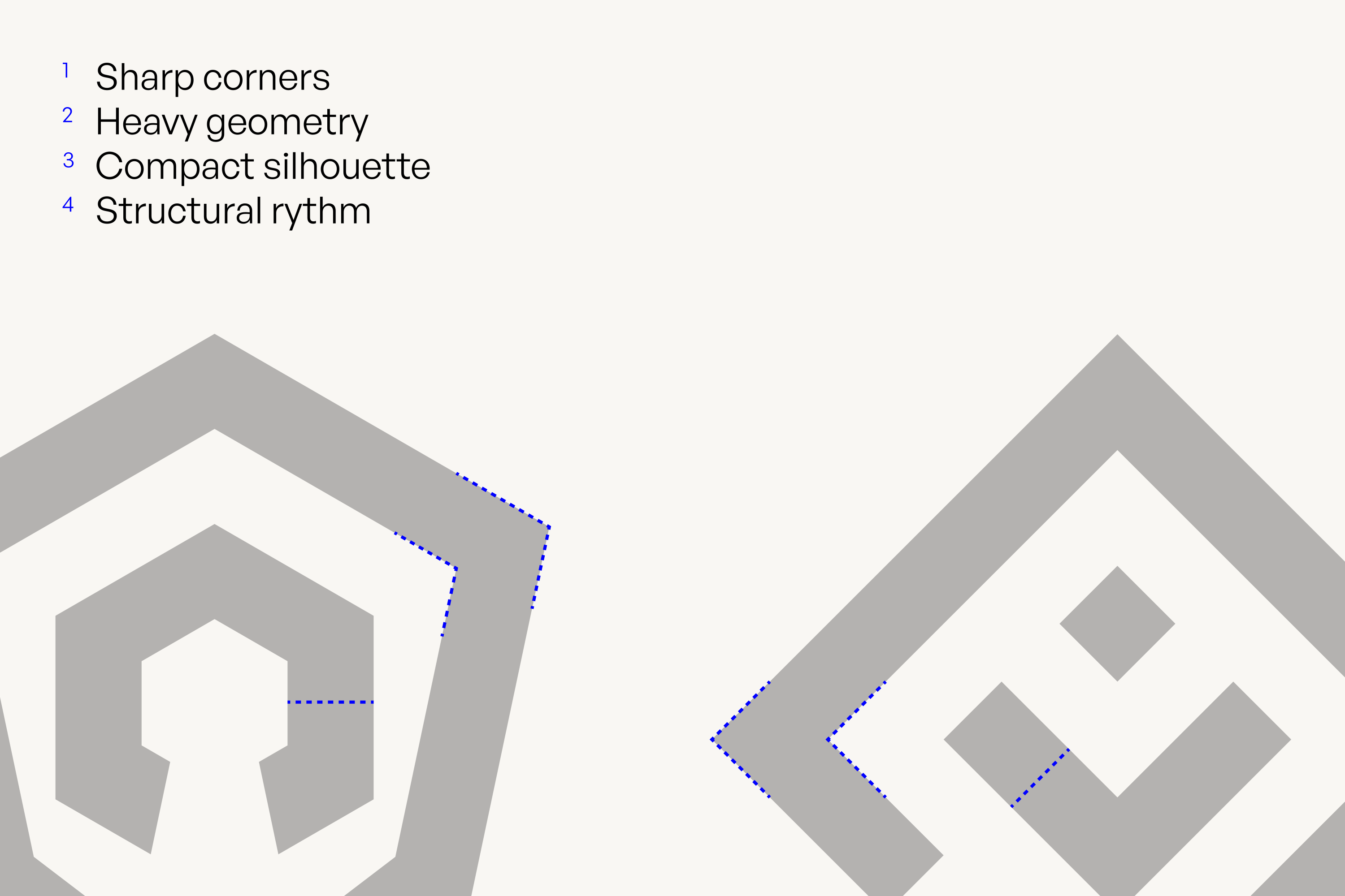
The Integralty mark is built from nested geometric forms that suggest separate elements working together as a single system. At the center, using the negative space, a keyhole introduces the idea of controlled access, while the outer shape represents an hexagon, strongly linked with IT, then the overall silhouette takes on the character of a shield. Together, these elements connect the ideas of integration, security, and protection without relying on a conventional cybersecurity symbol.

Brand Direction
Technical expertise without the distance.
The visual direction balances the precision expected from a cybersecurity company with a more human and approachable character. Structured geometry, strong contrast, and disciplined layouts communicate expertise, while warmer details and a less conventional visual language keep the brand from feeling overly corporate or inaccessible.


Logo System
A symbol where multiple layers become one.
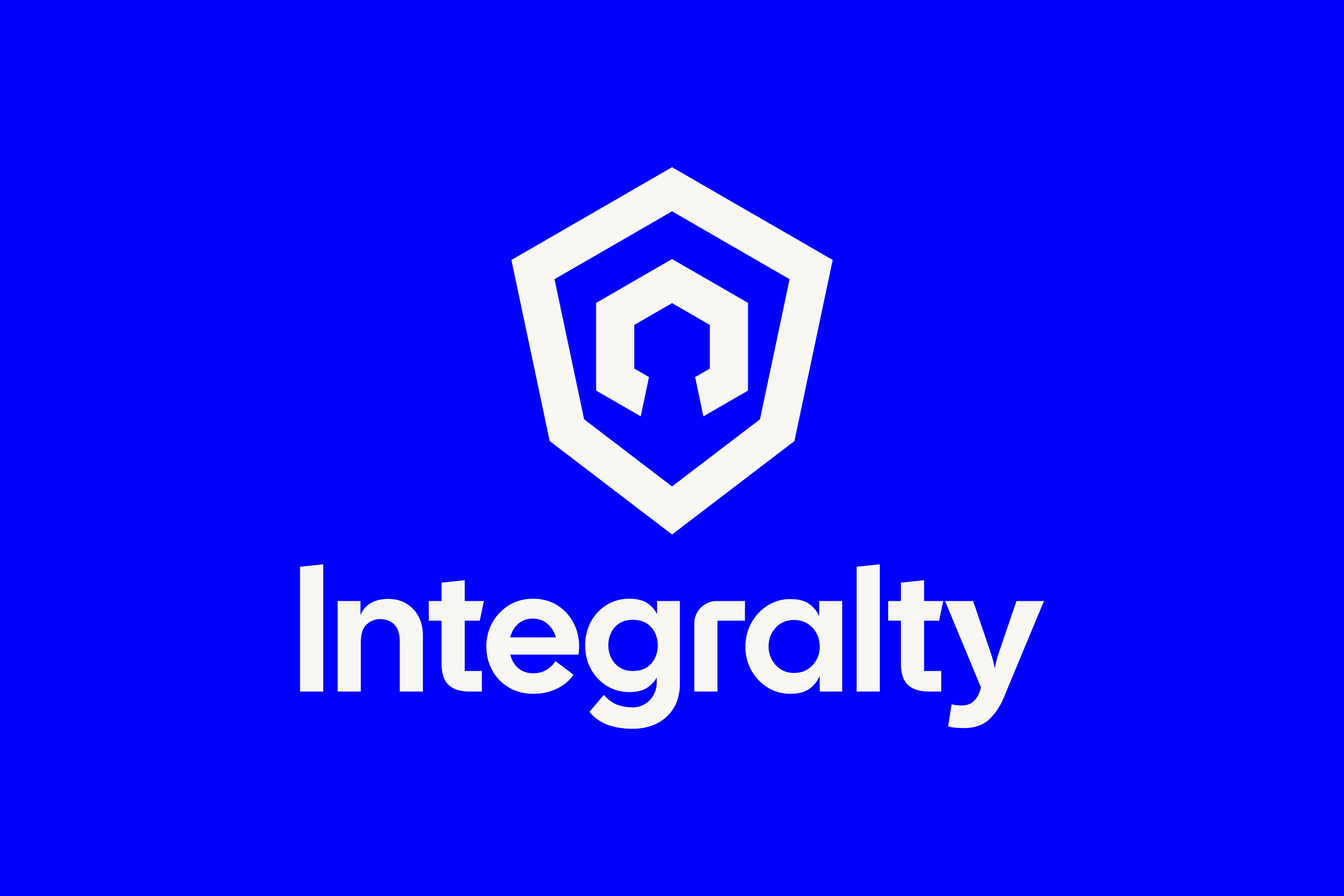
The identity centers on a compact mark designed to remain recognizable both independently and alongside the wordmark. Its layered construction reinforces the idea of integration while creating a distinctive visual anchor that can move easily between small digital environments and larger brand applications.
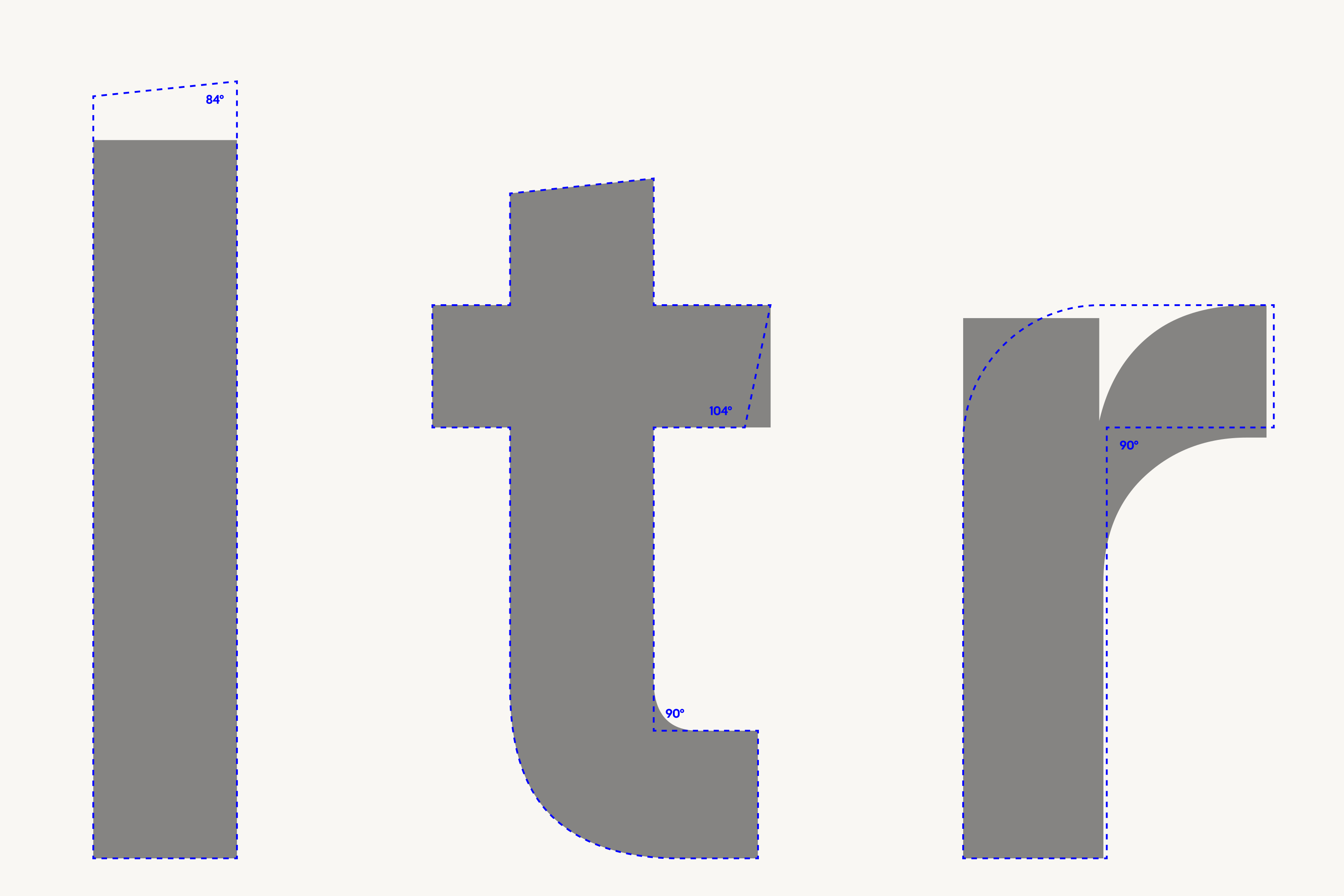
The wordmark began with Cal Sans and was refined through custom modifications to key letterforms. Subtle changes to characters such as the l, t, and r give the name a more proprietary character while preserving the approachable geometry of the original typeface.

COLOR
A dependable foundation with a deliberate point of energy.
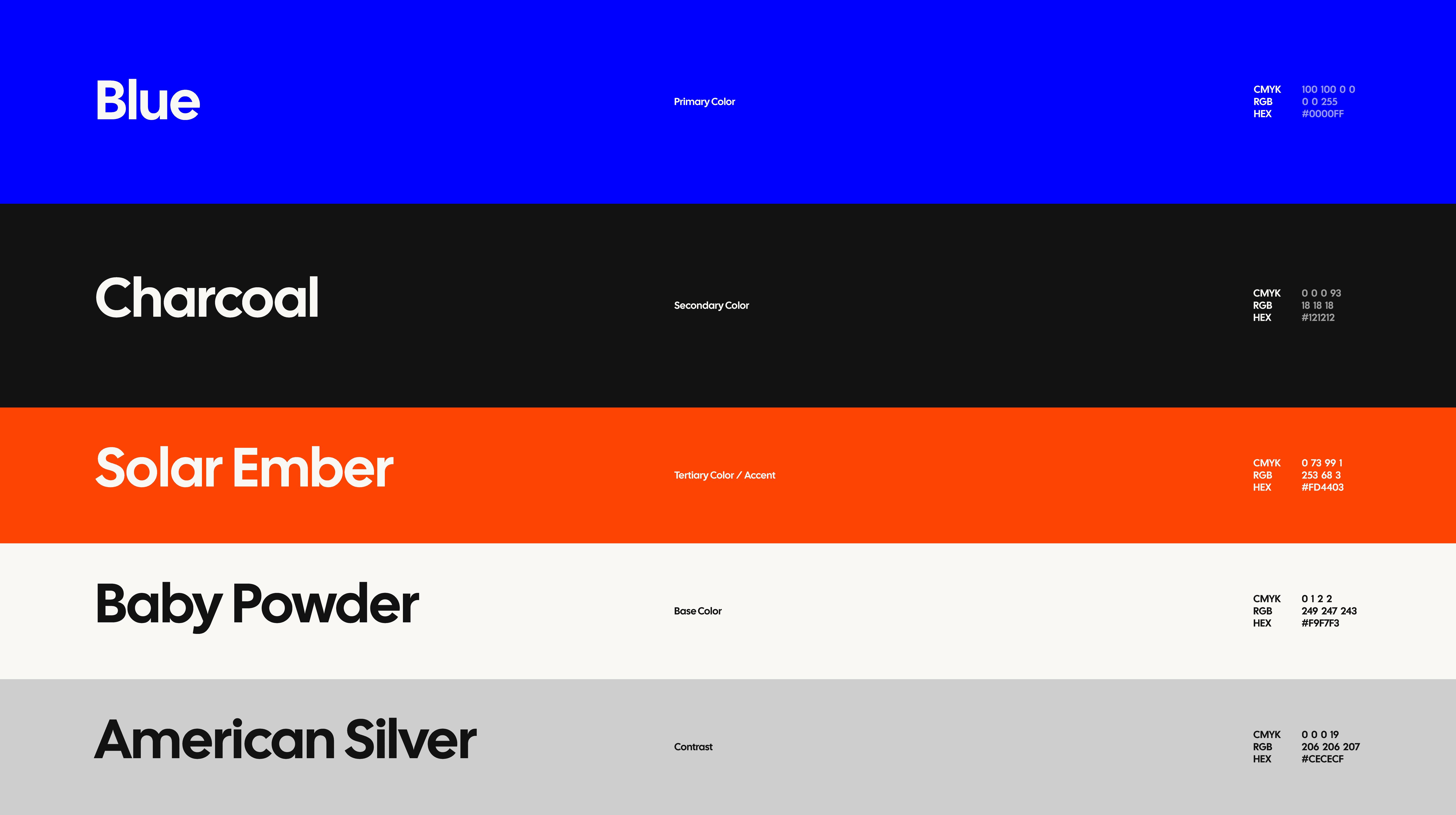
Blue provides the identity with a confident and dependable base, while charcoal adds depth and supports more technical communication. Solar Ember introduces a concentrated accent for moments that need emphasis, and a warm off-white softens the overall system. Together, the palette allows Integralty to feel authoritative without becoming cold or overly institutional.

Font Hierarchy
A hierarchy that balances character with clarity.
Cal Sans leads the Integralty identity across major headlines and key brand moments, giving the system a distinctive and confident voice. General Sans supports it across body copy, navigation, labels, and more information-heavy content, where clarity and flexibility matter most. Together, the two create a clear hierarchy: Cal Sans brings personality and recognition, while General Sans keeps complex cybersecurity communication structured, approachable, and easy to navigate.


In Application
Giving complex information a clear visual structure.
Cal Sans leads the Integralty identity across major headlines and key brand moments, giving the system a distinctive and confident voice. General Sans supports it across body copy, navigation, labels, and more information-heavy content, where clarity and flexibility matter most. Together, the two create a clear hierarchy: Cal Sans brings personality and recognition, while General Sans keeps complex cybersecurity communication structured, approachable, and easy to navigate.


Website
Turning a broad cybersecurity offer into a clearer digital experience.
Integralty’s website needed to communicate a wide range of services without forcing visitors to navigate the complexity behind them. The brand system was translated into a digital language built around clear hierarchy, generous spacing, structured content, and distinctive visual moments that help users understand both what Integralty does and how its different capabilities connect.


Illustrations
A visual language for ideas that are difficult to photograph.
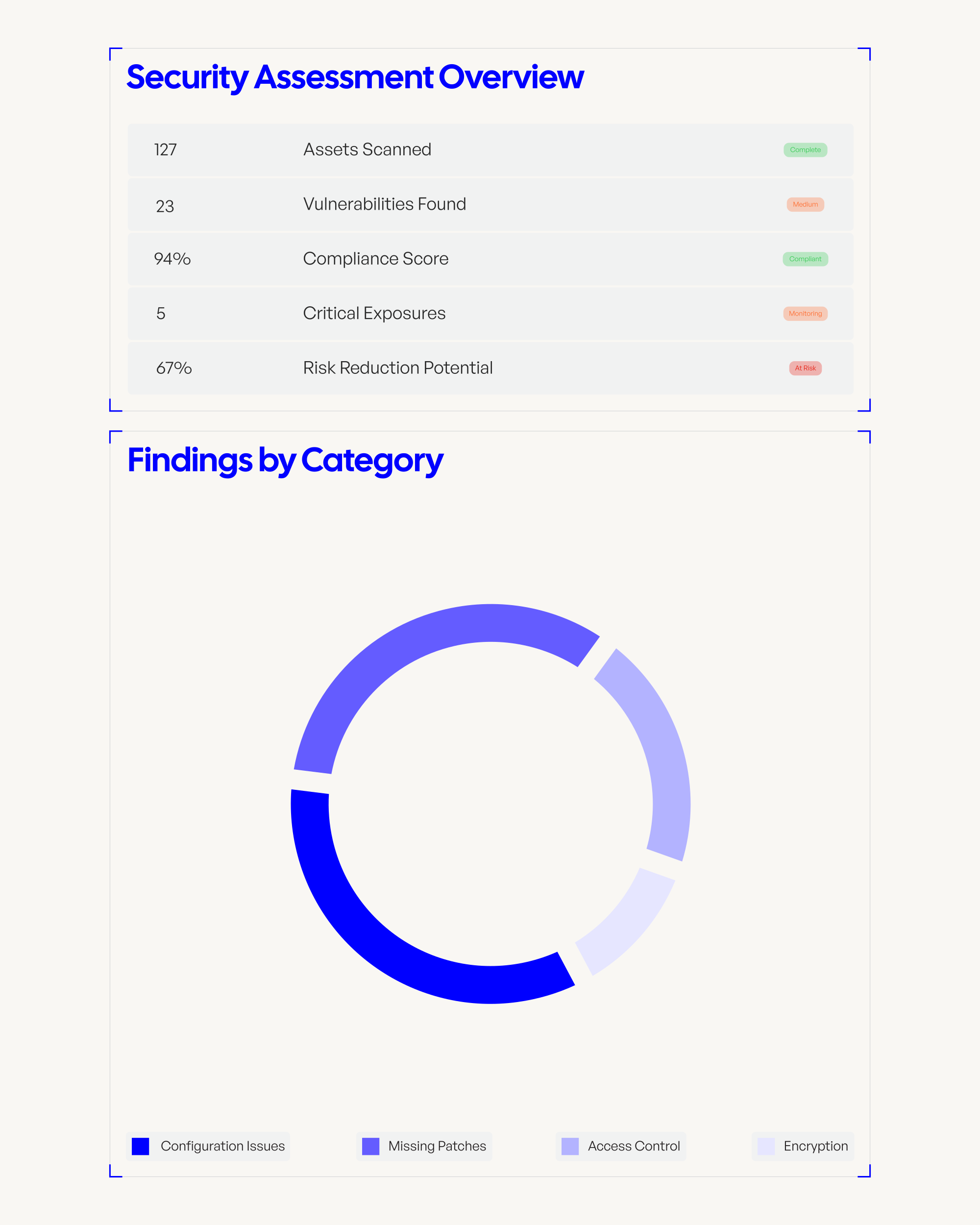
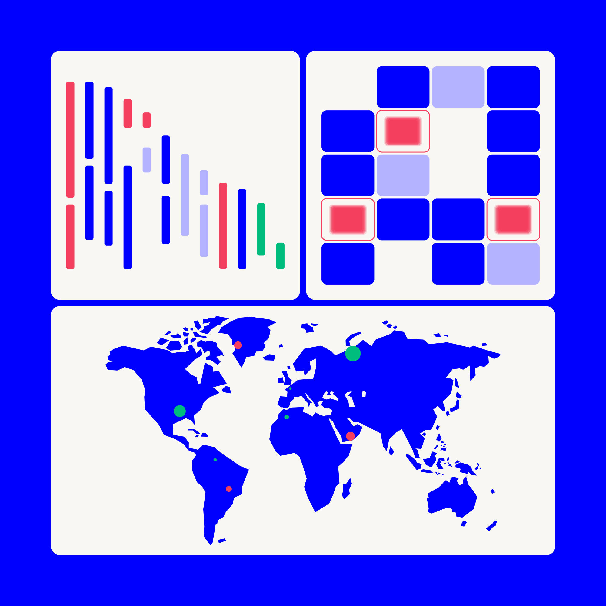
Custom illustration extends the identity beyond the logo and gives Integralty a more distinctive way to communicate abstract subjects such asassessments, incident response, managed services, and operational technology. The illustrations build from the same sense of structure and precision found elsewhere in the identity while giving the digital experience more character.

Extension
One foundation, adapted for a different audience
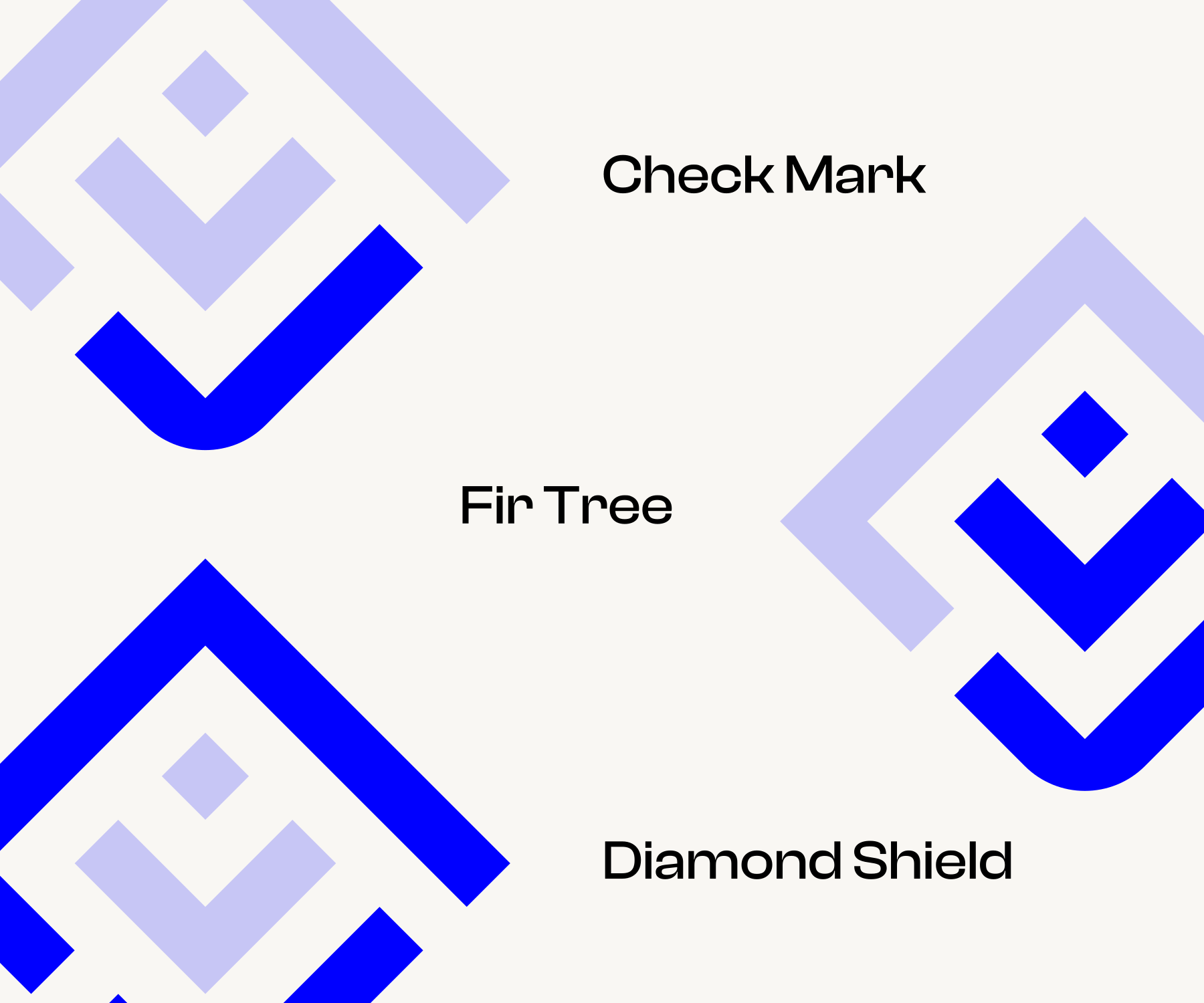
Integralty Growth Partners introduced a new challenge: creating an identity for an initiative aimed at venture capital, startups, and growing technology companies while preserving a clear relationship with Integralty. Rather than treating IGP as an unrelated brand, the system extends the principles of the parent identity into a more focused expression for a different part of the business.
The IGP identity retains recognizable elements of Integralty while introducing its own visual character. The result creates a clear relationship between the two brands without making the accelerator feel like simply another Integralty service, demonstrating how the original system could expand into a broader brand ecosystem.


TESTIMONIAL

Jeff Dyer
Founder & CEO of Integralty
Next
Project.
Continue through the selected work.
