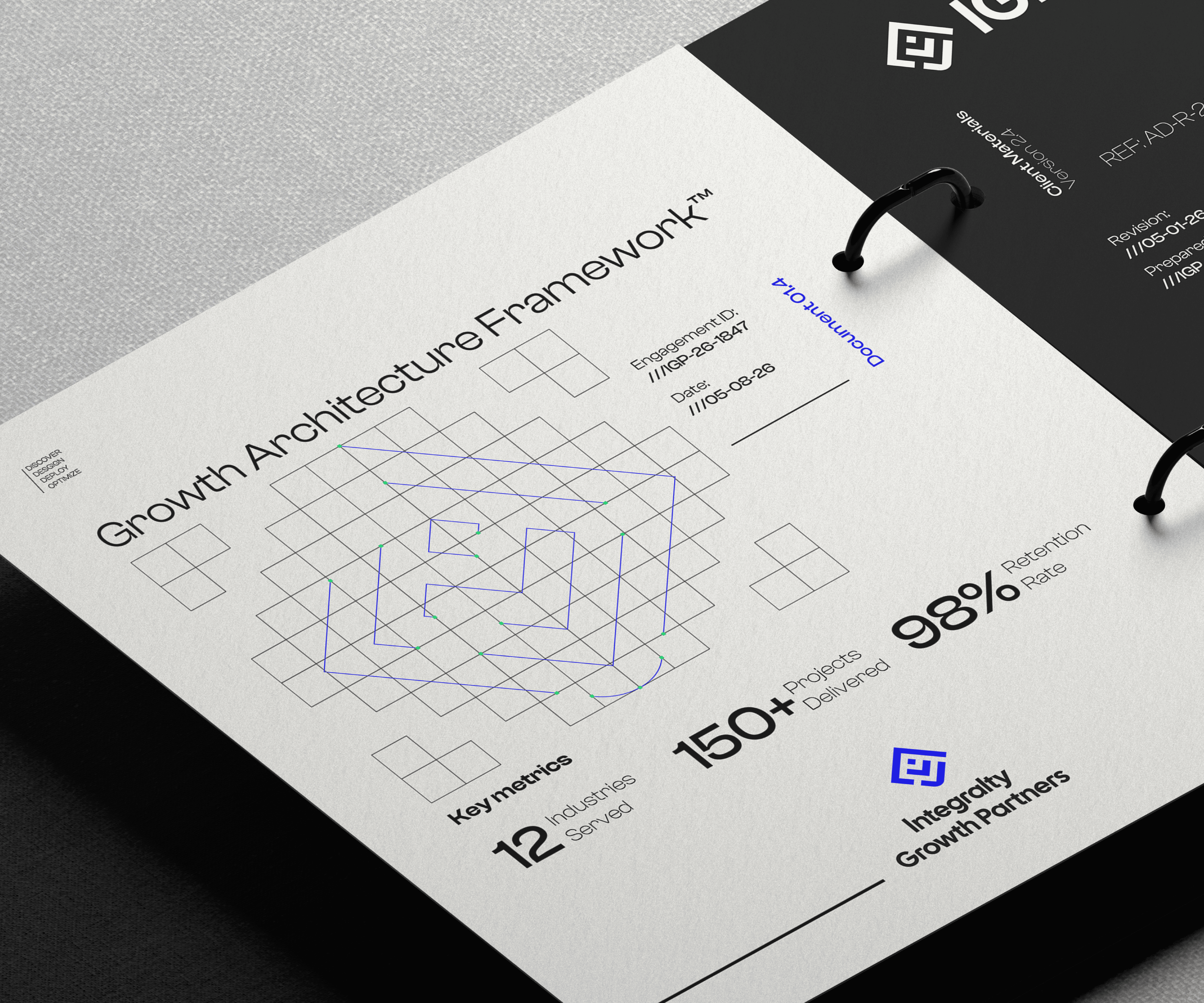
Integralty Growth Partners

Integralty Growth Partners (IGP) is a cybersecurity consulting firm dedicated to helping startups achieve industry-recognized security certifications such as SOC 2 and ISO 27001. By guiding companies through compliance, risk management, and security best practices, IGP enables growing businesses to build trust with enterprise clients, accelerate sales, and scale with confidence. As a strategic extension of the Integralty brand, the identity was designed to communicate security, credibility, and sustainable growth while maintaining a strong visual connection to its parent company.

Client

Integralty IT Consulting

DELIVERABLES

Visual Identity Website Design Illustrations

Year

2026

Design Process
Design Process

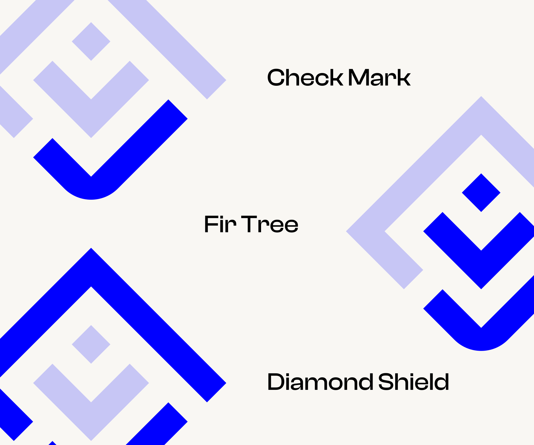
I focused on the ideas the company delivers: security, trust, and growth. The symbol was built by combining these concepts into a single, recognizable mark. Every element serves a purpose, allowing the logo to communicate the brand's value without relying on decorative details. The result is a mark that feels confident, scalable, and immediately associated with enterprise-grade security. Checkmark: Positioned at the base, the checkmark represents certification, compliance, and successful outcomes. It reflects the company's role in helping startups achieve recognized security standards. Fir Tree: Built from the upward structure of the mark, the tree symbolizes sustainable growth and long-term progress. Using the checkmark as its foundation reinforces the idea that meaningful growth begins with trust and security. Diamond Shield: The enclosing geometric form can be read as both a diamond and a shield. The closed shape communicates protection, reliability, and resilience.
Color System

Blue was selected as the primary brand color because of its strong psychological association with trust, security, intelligence, and reliability, qualities that are fundamental in cybersecurity and compliance. A vibrant, saturated blue modernizes these traditional associations, giving the identity an energetic and forward-looking character. It reflects the ambition of growing startups while maintaining the credibility expected from a security-focused consulting partner. The result is a color palette that feels both approachable and authoritative.

Color System

Blue was selected as the primary brand color because of its strong psychological association with trust, security, intelligence, and reliability, qualities that are fundamental in cybersecurity and compliance. A vibrant, saturated blue modernizes these traditional associations, giving the identity an energetic and forward-looking character. It reflects the ambition of growing startups while maintaining the credibility expected from a security-focused consulting partner. The result is a color palette that feels both approachable and authoritative.

Typography

The wordmark uses Cal Sans, the same typeface established for the Integralty master brand, preserving visual consistency across the brand ecosystem. To strengthen the relationship between the parent company and its growth-focused division, the same custom refinements developed for the Integralty wordmark were carried over to Integralty Growth Partners. This creates a cohesive visual language while allowing the sub-brand to establish its own identity through the distinctive symbol and naming. The clean geometric forms and balanced proportions of the typeface complement the precision of the logomark, resulting in a visual identity that feels modern, confident, and built for long-term recognition.

Typography

The wordmark uses Cal Sans, the same typeface established for the Integralty master brand, preserving visual consistency across the brand ecosystem. To strengthen the relationship between the parent company and its growth-focused division, the same custom refinements developed for the Integralty wordmark were carried over to Integralty Growth Partners. This creates a cohesive visual language while allowing the sub-brand to establish its own identity through the distinctive symbol and naming. The clean geometric forms and balanced proportions of the typeface complement the precision of the logomark, resulting in a visual identity that feels modern, confident, and built for long-term recognition.

Design Direction

Since IGP is a subbrand of Integralty IT Consulting, we only had to make one moodboard instead of two. We called it the calibration moodboard. The brand direction was pretty clear and the calibration moodboard translated that perfectly.

Design Direction

Since IGP is a subbrand of Integralty IT Consulting, we only had to make one moodboard instead of two. We called it the calibration moodboard. The brand direction was pretty clear and the calibration moodboard translated that perfectly.

2026 ® AYOUB BENNOUNA

2026 ® AYOUB BENNOUNA